Histogram of distribution of individual values, control limits, customer and production narrowing tolerance and scatter plot (data stratification), histogram pockets.

The histogram graph displays the distributions of individual values, both for control XmR-charts of individual values and for XbarR-charts of average and range subgroups with process control limits UNPL(x), CL(x), LNPL(x) and established tolerance limits ( specifications).
![Button [Automatic update of graphs with Shewhart control charts]](https://advanced-quality-tools.ru/images/buttons/sqlite_autoplay.png)
This function is included in the list of parameters saved in the chart properties when saved in the list for automatic chart updates with a selected timeout or to quickly open them with updated data.
The histogram of the distribution of individual values is supplemented with a dot plot, which reveals information about the process hidden by the histogram. You can learn more about the benefits of such data visualization from the open solution: Is analysis of distribution histograms enough? Start by constructing Shewhart control charts .

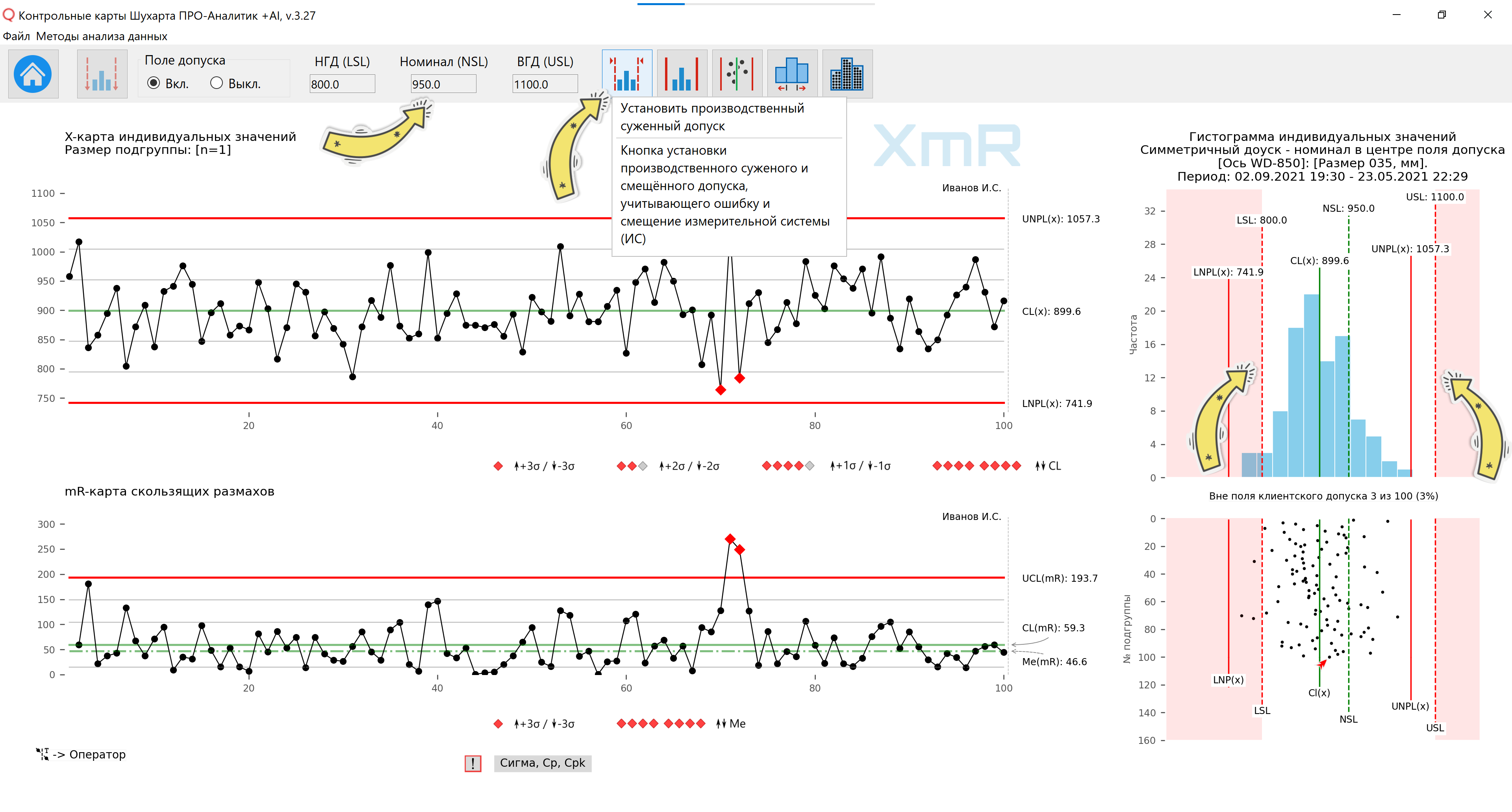
Figure 1. A tooltip is displayed when you hover the mouse over the button to go to the control panel for process tolerances and goals on the graphs. Software "Shewhart control charts PRO-Analyst +AI (for Windows, Mac, Linux)". red arrow ♠ on a scatter plot indicates the last point in the time series.

Figure 2. Client access control panel (process goals). A tooltip is displayed when you hover the mouse over the abbreviated name [IOP (USL)]. Software Shewhart control charts PRO-Analyst +AI.
Legend: UNPL(x) - Upper Natural Process Limit / Upper natural process limit; CL(x) - Center Line / Central line (process average); LNPL(x) - Lower Natural Process Limit / Lower natural process limit; LSL(x) - Lower Specification Limit; NSL(x) - Nominal Specification Line; USL(x) - Upper Specification Limit; UCL(mR) - Upper Control Limit(mR) / Upper control limit of moving ranges CL(mR) - Center Line(mR) / Central line of moving ranges (average mR); Me(mR) - Median Line(mR) / Line of the median of moving ranges
Boundaries of the client tolerance field (regular)
The Customer Tolerance Bounds feature, displayed as dotted lines in the histogram and scatter plots, allows you to demonstrate any tolerance conditions or process goals:
- Not installed.
- Installed (symmetrical - nominal in the center of the tolerance field).
- Installed (asymmetrical - the nominal value is shifted from the center of the tolerance field).
- Set (one-sided - lower or upper tolerance limits only).
- The goal of the process is set - only the target average (nominal).
- Established (one-sided - only the lower or upper tolerance limit with the established value) - a rare case.

Figure 3. Tolerance not specified. Software Shewhart control charts PRO-Analyst + AI.

Figure 4. Tolerance set (symmetrical - nominal in the center of the tolerance field).

Figure 5. The tolerance is set (asymmetrical - the value is shifted from the center of the tolerance field).

Figure 6. Tolerance set (one-sided - lower tolerance limit only).

Figure 7. Tolerance set (one-sided - only upper tolerance limit).

Figure 8. The process goal is set - only the target average (nominal). Option to set a plan or norm.

Figure 9. The process goal has been established - the target average (nominal) and the lower tolerance limit (rare case).

Figure 10. The process goal has been established - the target average (nominal) and the upper tolerance limit (rare case).
Boundaries of the production tolerance field (acceptance tolerances, narrowed and shifted), taking into account the error and displacement of the measuring system
A unique feature demanded by quality practitioners that is not available from any Quality Management software provider.
If you have to grade products before shipping against customer tolerance limits, you must account for the uncertainty introduced by error and bias in your measurement system for boundary products at the lower and upper limits of that tolerance.
So, if your measurement system is in a statistically stable state (evaluated using an XmR card of 25-30 test-retest measurements of the same standard (reference)), then the graph shows a histogram of individual values instead of the boundaries and nominal client tolerance (USL( x), NSL(x) LSL(x)), the boundaries of the production (acceptance, narrowed) tolerance can be displayed, obtained taking into account the error and bias of the measuring system for user-selected minimum probabilities (85%, 96%, 99% and 99, 9%) compliance with customer tolerance of products sorted for shipment. This function is used when dividing products into good and bad, taking into account the corresponding narrowing of the established limits of the client tolerance from one to four probable errors (probable error) of the measurement system (0.675 σ measuring system) on each side and a shift of the acceptance tolerance field by the amount of the offset of the measuring system systems.
Rice. 11. A tooltip has been displayed when you hover the mouse over the [Set Production Restricted Tolerance] button to go to the production restricted and offset tolerance control panel. The distribution histogram and scatter plot display the customer tolerance (LSL, NSL, USL), before applying the narrowed and shifted manufacturing tolerance field.
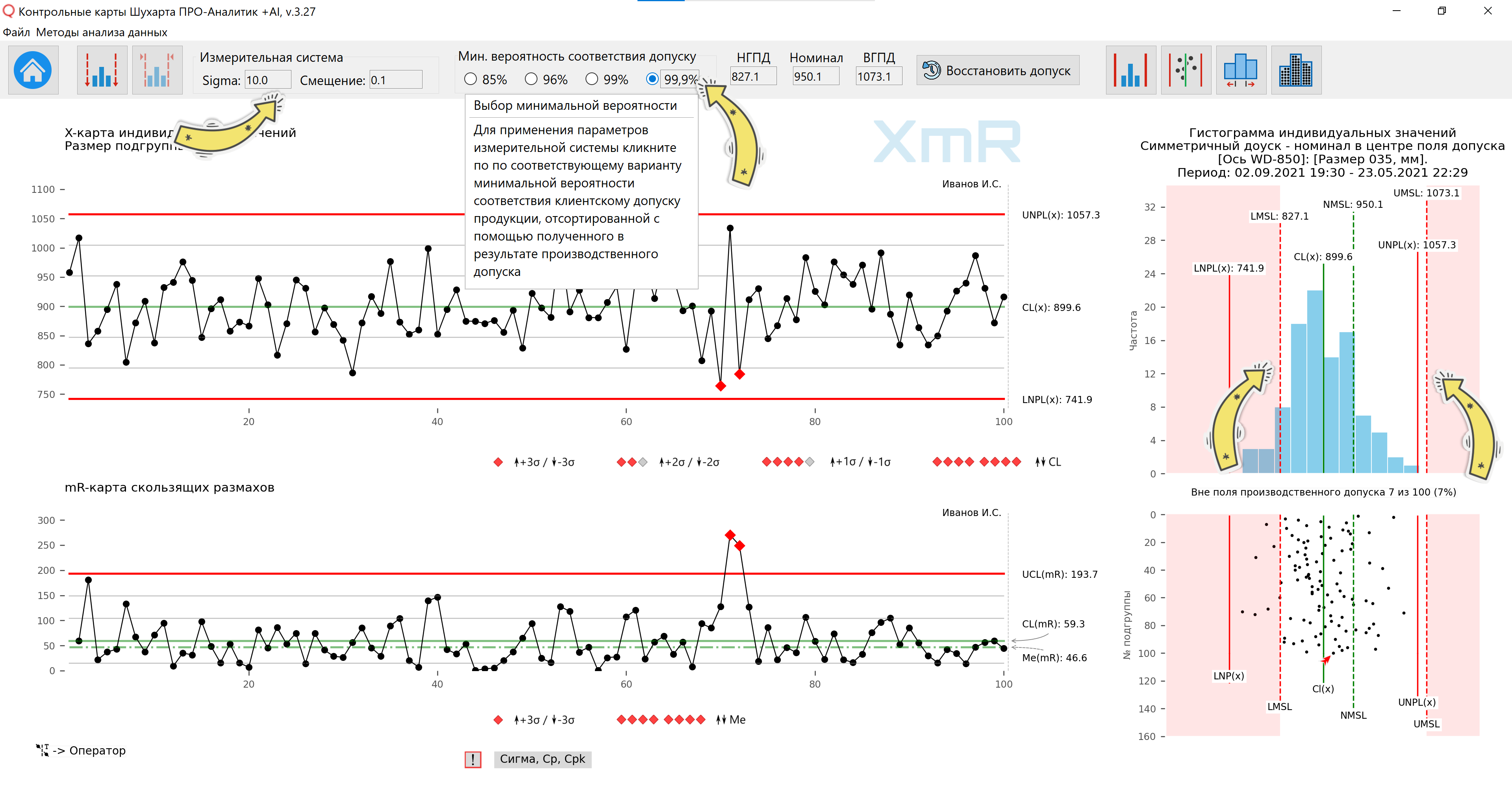
Rice. 12. The distribution histogram and scatter plot display a narrowed and shifted field of production tolerance, taking into account the error (σ) and the bias of the measuring system. The minimum probability (99.9%) of compliance with the customer tolerance of the rejected parts relative to the production narrowed tolerance of the parts was selected (narrowing on each side by 4 (four) probable errors of the measuring system). A tooltip is displayed when you hover the mouse over the minimum probability value.
Legend to the figure: LMSL - Lower Manufacturing Specification Limit / Lower limit of production tolerance; NMSL - Nominal Manufacturing Specification Line / Line of nominal manufacturing tolerance field; UMSL - Upper Manufacturing Specification Limit
[σ] IS - error of the measuring system (MS), which is in a statistically controlled state. Evaluating the error of a measuring system has practical meaning only if the constructed XmR-charts of individual values and sliding ranges of 25-30 “test-retest” measurements of the same standard (reference) demonstrate a statistically stable state.
To fill in the [IC Offset] field, see the rule for determining the offset of the measuring system in the description of the software function: Checking the displacement of the measuring system detected by the Shewhart control chart .
The user can apply in the calculation of the production narrowed tolerance options for the minimum probabilities (85%, 96%, 99% and 99.9%) of compliance with the client tolerance of products sorted for shipment by clicking on the corresponding radio button, after which the values of the border fields with the nominal value will be filled in production narrowed and shifted tolerance fields and display of production tolerance boundaries on a histogram and dot plot.
For more details on the need to sort products into defective and non-defective with respect to production tolerances, which are fields of normal (customer) tolerances narrowed taking into account the error of the measuring system, see the article by Donald Wheeler: Is the product on specification actually compliant?
Control limits and process centerline on histogram and scatter plot
![Button [Displays calculated and modified control limits on histograms and scatter plots]](https://advanced-quality-tools.ru/images/buttons/controlline_hist.png)
The software allows you to enable/disable control limits and the central line of the process UNPL(x), CL(x), LNPL(x) for individual values in the histogram and scatter plot for both the XmR-chart window of individual values and moving ranges, and for the window with XbarR-chart of subgroup averages and ranges.
If the data cannot have negative values, as specified by the user in the source data or when constructing the control chart, the lower control limit with a negative value is not displayed (the process has a skewed distribution).

Figure 13. A tooltip is displayed when you hover over the button to go to the control panel (enable/disable) process control limits on the histogram.

Figure 14. The control panel for enabling/disabling process control limits on the histogram is open. Process control limits are included.

Figure 15. The control panel for enabling/disabling process control limits on the histogram is open. Process control limits in the histogram are disabled.

Figure 16. A tooltip is displayed when you hover the mouse over the button to go to the control panel for displaying process control limits on a scatter plot. Process control limits in the histogram are disabled.

Figure 17. The control panel for enabling/disabling process control limits on a scatter plot is open. Scatter plot process control limits are disabled.
Setting a custom histogram pocket size
An indispensable function when constructing an XmR control chart for discrete values (counts), when it is useful to use a pocket size equal to an integer, for example, equal to 1 (one). The function is called by clicking on the [Set histogram pocket size] button. When updating control charts, the user-defined pocket size is retained, as are other report presets. When constructing control charts from “0” or based on queries to external data, the calculated size of the histogram pocket is set.
![[Set custom histogram pocket] button](https://advanced-quality-tools.ru/images/articles/scc-python-tolerance-17.png)
Figure 18. Tooltip when hovering over the button to go to the custom histogram pocket control panel.

Figure 19. Control panel for setting a custom histogram pocket. Set the custom histogram pocket size to 1 (one) for the histogram of the distribution of discrete values (counts).

Figure 20. Control panel for setting a custom histogram pocket. The custom histogram pocket size is set to 2 (units) to demonstrate how the shape of the distribution histogram changes depending on the pocket size.
To change the size of histogram pockets without reference to discrete values, you can use the function histogram scaling , changing the number of pockets at your discretion.
Demonstration of forming histogram bars from individual values
With this helper function, the user can visually understand and demonstrate to their team how histogram bars are formed from individual data points (individual values). For a better understanding by users of the graphical tools of our software, you can use the dynamic mode to demonstrate the accumulation of histogram columns using simulator functions . Dynamic demonstration (Figure 21) is implemented in a similar way to Galton's board .
![[Set custom histogram pocket] button](https://advanced-quality-tools.ru/images/articles/scc-python-tolerance-19.png)
Figure 21. A tooltip is displayed when you hover the mouse over the button to go to the control panel for demonstrating the formation of histogram columns.
![[Set custom histogram pocket] button](https://advanced-quality-tools.ru/images/articles/scc-python-tolerance-20.png)
Figure 22. The panel for a static demonstration of the formation of histogram columns is open.
![[Set custom histogram pocket] button](https://advanced-quality-tools.ru/images/articles/scc-python-tolerance-21.png)
Figure 23. Dynamic demonstration of histogram formation using simulator functions . The histogram graph remains in demo mode.
Video 1. Dynamic demonstration of histogram formation using simulator functions .
Video 2: Histogram of distribution of individual values, control limits, customer and production narrowing tolerance and scatter plot (stratification of data), histogram pockets and demonstration of forming a histogram from individual values.
Limit of maximum possible value
You can enter in the additional information sheet the minimum possible value, for example, [0] and the maximum possible value [MaxPVL(x) - Maximum Possible Value Line], for example, 100 for the oil water cut indicator. This is useful when the process does not have an upper control limit due to limitations in the nature of the metric being analyzed.
![[Set custom histogram pocket] button](https://advanced-quality-tools.ru/images/articles/scc-python-maximum_possible_value.png)
Figure 24. Line of the maximum possible value for the water cut of produced oil.