Scaling Shewhart control chart plots along the X and Y axes
![Button [Scaling Shewhart control chart graphs along the X and Y axes]](https://advanced-quality-tools.ru/images/buttons/ChartScaling.png)
The graph rescaling feature allows you to display only the area of the control chart that interests you. Additionally, this helps to avoid overlapping labels for points when there are more than a hundred of them on the control chart. The [Y] axis scaling feature makes it easier to visually compare the spread of data across different control charts.
Scaling Shewhart control chart plots along the X axis

Figure 1. A tooltip has been introduced when hovering the mouse over the button to go to the control panel for scaling Shewhart control chart graphs along the X (axis of subgroup numbers) and Y (axis of values) axes.

Figure 2. Control panel for scaling control charts along the [X] and [Y] axes. A drop-down tooltip is displayed when you hover the mouse over the button to go to the control panel for scaling Shewhart control chart graphs along the X axis (the axis of subgroup numbers).

Figure 3. Control panel for scaling Shewhart control chart graphs along the X-axis (axis of subgroup numbers). In the figure, scaling is applied to display the range from subgroup 39 to subgroup 57. The range of points displayed on the control chart chart is selected by dragging the sliders of the corresponding widget in the control panel. The [Apply] button is used to apply the selected range to the control chart plot, and the [Cancel] button cancels the scaling. The scatter plot below the histogram shows subgroups hidden by scaling in gray.
Video 1. The function of changing the scale of graphs allows you to display only the area of the control chart that interests you.
Scaling Shewhart control chart plots along the Y axis

Figure 4. Control panel for scaling control charts along the [X] and [Y] axes. A drop-down tooltip is displayed when you hover the mouse over the button to go to the control panel for scaling Shewhart control chart graphs along the Y axis (value axis).
You can use the Y-Axis (Value axis) Min-Max range derived automatically from the current graph, or set the Min and Max values manually.

Figure 5. Control panel for scaling control charts along the [Y] axis. A drop-down tooltip is displayed when you hover the mouse over the button for automatically obtaining the maximum and minimum values along the Y axis (value axis) of the current X-control chart graph of individual values that are entered into the corresponding value fields.

Figure 6. Control panel for rational grouping of data . In the graph area, a control XbarR-chart of the averages and ranges of subgroups is displayed for the data from which, in the previous step, a control XmR-chart of individual values and moving ranges was constructed and the Min, Max values along the Y axis were obtained.

Figure 7. Control panel for scaling control charts along the [Y] axis. The maximum and minimum values along the Y axis (value axis) obtained for the Shewhart control XmR-chart are applied to the control XbarR-chart of the averages and ranges of subgroups, see Figure 5. Clicking on the [Cancel] button will cancel the applied scaling along the Y axis and return to automatic scaling of the top graph of the control chart.
The animation below shows one example of using the scaling function of Shewhart control charts for individual values (XmR) in comparison with control charts of subgroup means and ranges (XbarR) with subgroup sizes n=4 and n=9, built for the same data series . See the open source solution for an explanation of the practical value of this feature Comparing monthly averages with standards for daily individual measurements is ignorant. Examples of the widespread use of "average hospital temperature".
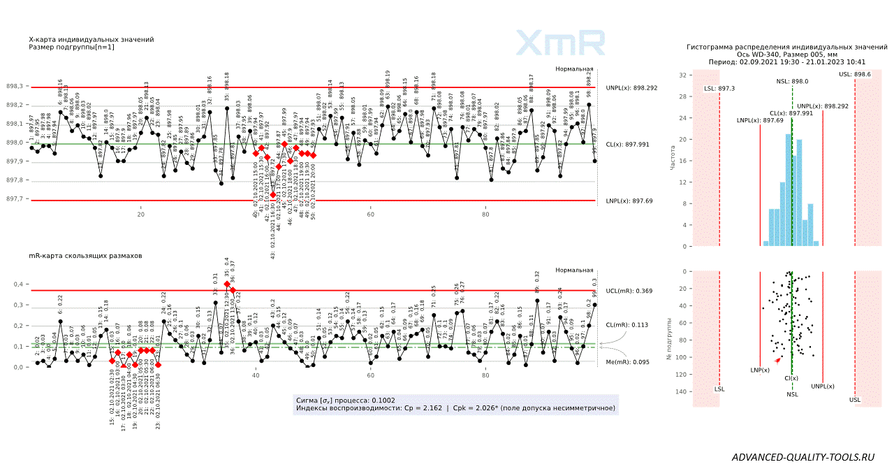
Figure 8. Shewhart control charts for individual values (XmR) versus subgroup mean and range (XbarR) charts with subgroup sizes n=4 and n=9, plotted for the same data series.
Scaling a histogram plot along the X and Y axis with equal size pockets

Figure 9. A tooltip has been introduced when hovering the mouse over the button to go to the control panel for scaling the histogram graph along the X (histogram pocket axis) and Y (frequency axis) axes.

Figure 10. A tooltip has been introduced when hovering the mouse over the button to obtain the values of the minimum along the X axis, the maximum along the X and Y axes, and the number of histogram pockets that fit within the limits of the X axis (Max X - Min X). By clicking the [Get Min X, Max X, Y] button, the corresponding fields on the right are automatically filled in.

Figure 11. A tooltip has been introduced when hovering the mouse over the label of the field with the number of histogram pockets.

Figure 12. Control chart and histogram with scatter plot plotted from new data set. By clicking the [Apply] button, the values from the corresponding fields on the left are automatically applied to the histogram graph. See an example of using this function in an open source solution: Distortion of product quality control data through substitution of values that do not fit into the tolerance range.

Figure 13. By clicking the [Apply] button, the values from the corresponding fields on the left, obtained from the histogram graph in Figure 11, are applied to the histogram graph from Figure 12 (above).
You can change any option displayed in the histogram scaling control panel text boxes to apply it to the histogram plot and scatter plot.