Is it enough to analyze distribution histograms and reproducibility indices Cp, Cpk? Start your analysis by building Shewhart control charts!
The material was prepared by the scientific director of the AQT Center Sergey P. Grigoryev
Free access to articles does not in any way diminish the value of the materials contained in them.
In the quality assurance department of one research and production company, I was shown a histogram of the distribution of a key quality indicator, which specialists used when investigating the causes of a serious accident; their arguments were more like fortune telling on coffee grounds. No one had any idea about the statistical state of the production process for this indicator.
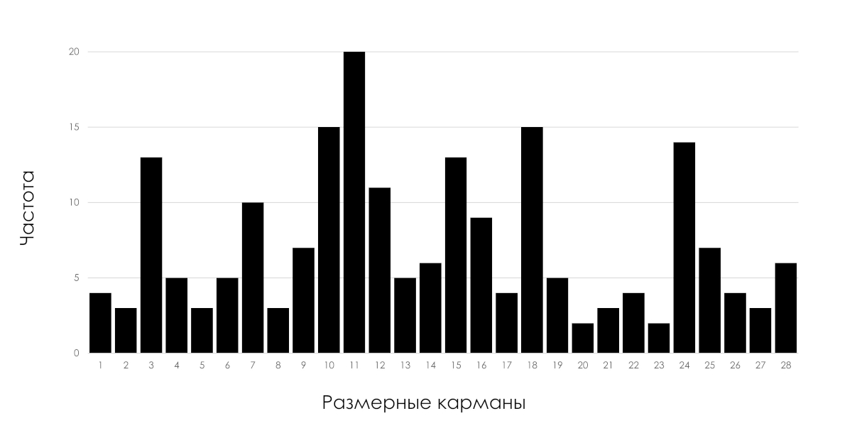
Rice. 1: Histogram of distributions of a key quality indicator.
Why is it important?! An accident is a consequence, not a cause.
The histogram of the indicator distribution shown in the figure above can be the result of the functioning of both statistically stable (predictable) and statistically unstable (unpredictable) processes.
If manufacturing records the part parameters for this histogram, why aren't Shewhart control charts maintained to track the statistical status of the process? The control charts would report the production process problem that was responsible for the failure of the part as soon as possible, even if the control parameter of the part was still within the tolerance limits. Production personnel would have reason to stop the production process until the specific cause of the problem is determined and corrected. For the parts produced during the period affected by the process disorder, it was necessary to make a decision to pass them further or reject them, I emphasize, even if these parts corresponded to the tolerance range. Parts produced by a process that is in a statistically unstable (unpredictable) state are not homogeneous, they are significantly different. Tolerance limits for determining uniformity are not applicable. It is important to understand this for particularly critical parts.
The choice between two opposing types of measures in relation to it in order to improve it depends on the statistical state in which the analyzed process is located. See the detailed explanation in the article " Nature of Variability ".
Below is Edwards Deming's explanation of the problem of interpreting density histograms that gave rise to this case.
"Statistics courses often begin with the study of distributions and their comparison. Students are not warned in classes or in books that for analytical purposes (such as process improvement) distributions and the calculation of mean, standard deviation, chi-square values, t - statistics, etc. are useless unless the data were obtained for the process in a state of statistical control
Accordingly, the first step in examining data is to understand whether it was obtained in a state of statistical control. The easiest way to analyze data is to arrange the points in the order they appear to see if anything can be learned from the distribution formed by the data.
As an example, let's look at a distribution that seems to have the best characteristics, but is not only useless, but misleading. In Fig. Figure 2 shows the distribution of measurement results for 50 springs of the same type used in a camera of a certain type. The springs were measured by stretching under a force of 20g.
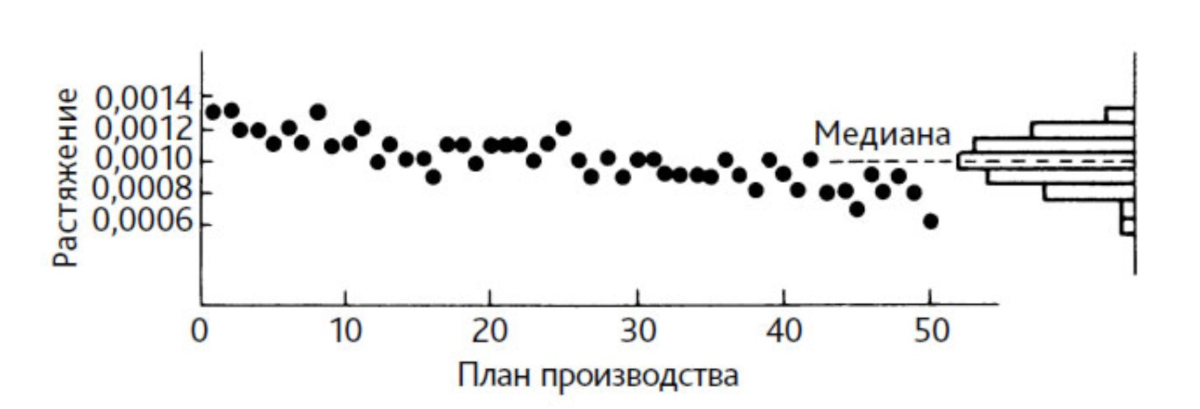
Rice. 2. Scatter plot of the process with a distribution histogram for 50 springs tested in the order of their manufacture. Source: [2] Edwards Deming, book "Overcoming the Crisis", pp. 224-225
If production time is not taken into account, the data (Figure 2) form a symmetrical distribution, but if they are arranged in the order of production of the springs, the distribution is found to be useless. For example, the distribution would not tell us what tolerance the finished springs might fall into. The reason is that there is no identifiable process.
The distribution appears to be fairly symmetrical and within the tolerance limits. It is tempting to conclude that the process is in a satisfactory state. However, the tensile values, arranged in order of production time, show a decreasing trend.
There is something wrong with the manufacturing process or the measuring device. Any attempt to use the distribution shown in Fig. 2, useless. For example, calculating the standard deviation for a given distribution will not produce a value that can be used for prediction. It says nothing about the process because it is unstable.
Thus, we learned a very important lesson - to analyze data you need to look at it. Place the points in order of production or some other reasonable order. For some problems, a simple scatter plot is useful.
What if someone tried to use this distribution to calculate process reproducibility metrics? He will fall into a trap from which it is difficult to escape. The process is unstable. No reproducibility can be attributed to it at all.
The distribution (histogram) only demonstrates the accumulated data of the process, without saying anything about its reproducibility. A process is only reproducible if it is stable. Process reproducibility is achieved and confirmed through the use of a control chart, but not by the distribution itself. As we have already seen, even a simple process chart gives an idea of the reproducibility of the process."
In our software The histogram of the distribution of individual values is complemented by a scatter plot below the histogram (Figure 3), which demonstrates the information about the process hidden by the histogram and is the best basis for data stratification.
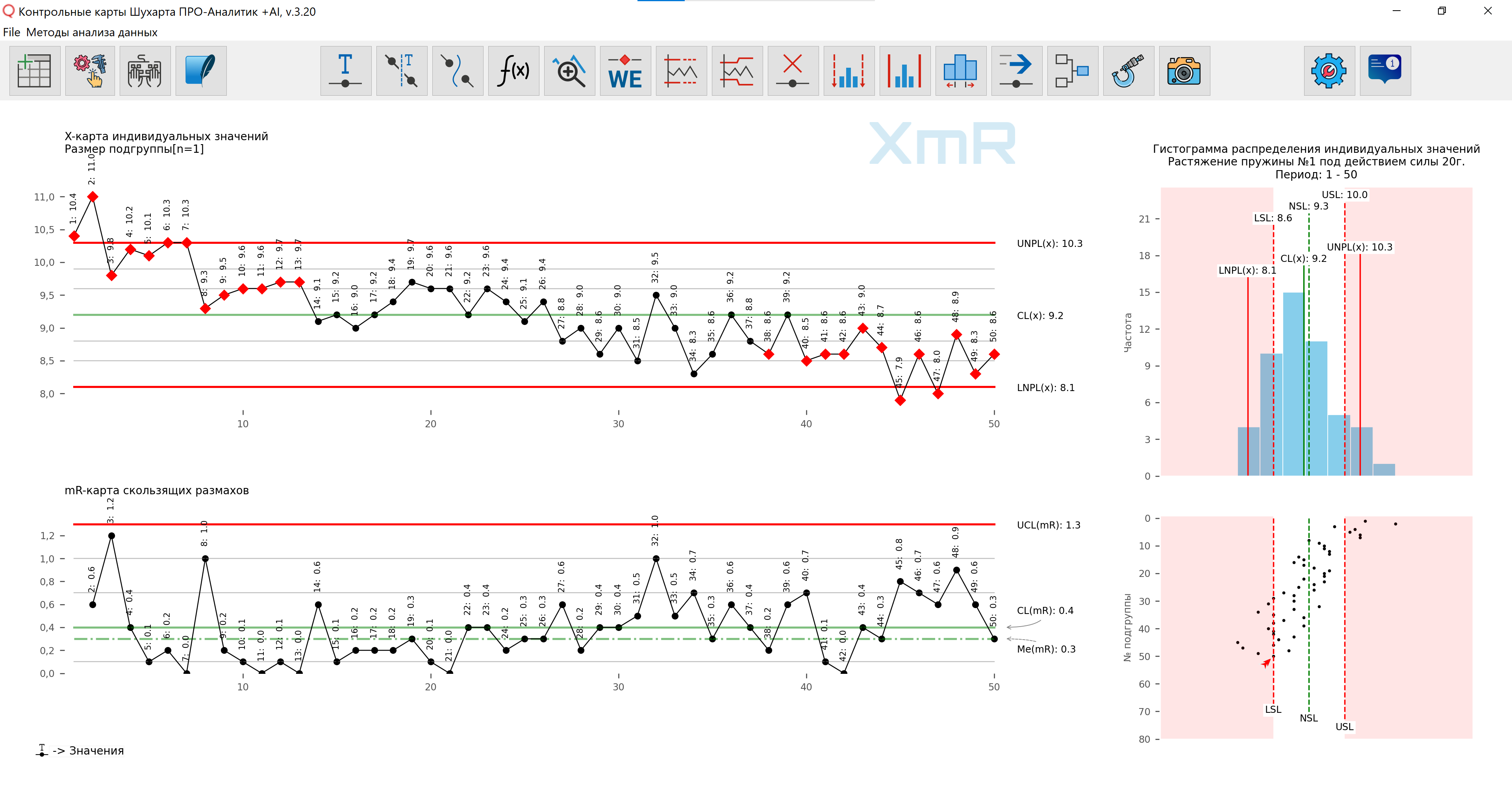
Figure 3. Figure prepared using our developed software .
You should build simple XmR control charts of individual values and moving ranges according to the data, in chronological order of product output, namely output, and not the order of sample measurement .
Common mistake! Products received for inspection are transferred to a common pile, and inspectors select them according to the principle that it is convenient to take them first and make notes in the same order; the chronological order of product output is lost.
Take care to collect this data in advance, marking the order of production in some convenient way. Moreover, the data in the histogram can belong to different types of sources of variability (machines, operators, supervisors, batches of raw materials, etc.) and sources of variability within a type (for example, machine-1, machine-2, machine-3). Although Shewhart control charts are good at analyzing data from a mixture of sources of variability, when you use information about the sources of variability available for accounting (constructing control charts in the context of sources of variability), you will gain significantly more information about the process and, as a result, you will have more opportunities for its improvement. Again, be sure to collect this data in advance. And take care of procedures that ensure data traceability, this will greatly facilitate the identification of cause-and-effect relationships.
At the next level, you can analyze the output of the process using the XbarR-chart of averages and ranges of subgroups.
So, for the Shewhart XbarR control card you will need rational grouping of data into subgroups taking into account the type and sources of variability. For example, to analyze the dependence of an indicator on specific operators, grouping data into subgroups should ensure that data from different operators do not fall into any one subgroup.
Managers often refer to the notorious “human factor,” explaining the vast majority of enterprise problems. Of course, all people are different from each other - how could it be otherwise?! But I want to remind you that when analyzing the work of people, you observe the result of the interaction of various employees with the system built by your management, and the influence of the system on the output of the process is much higher than the personal contribution of individual employees, unless they are artists with their own paints, brushes and canvas.
For people with an inquisitive mind.
There is another pitfall in using histograms (generalization) - the size of the histogram pocket (column width) into which individual values fall. It may turn out that a measurement slightly different from the one that went into the right pocket ends up in the left one. The same thing happens with products falling within the tolerance zone and beyond it, see definition Taguchi quality loss functions . I adapted Taguchi's approach for this case. So, within one pocket of the histogram, all individual values add equal frequencies, increasing the height of the column. If the values are slightly outside the boundaries of the pocket, they fall into the right or left pocket, respectively. But the differences between the values falling into one pocket are much greater than those between the values located at the common boundary in neighboring pockets. Therefore, the histogram is a useful but generalizing tool, and those who compare adjacent bars can be easily misled. Moreover, the size of the histogram bars significantly depends on the size of the histogram pocket; you can easily verify this by constructing histograms with different pocket sizes for the same data series. Our software will help you do these simple experiments with discrete data. setting a custom histogram pocket size , and for continuous values the function: Scaling a histogram plot along the X and Y axis .
Reproducibility indices Cp, Cpk
It is pointless to calculate reproducibility indices Cp and Cpk for unpredictable processes; unpredictable processes are not reproducible by definition.
Even for processes that are in a statistically controlled state, reproducibility indices should only be used in the pair Cp, Cpk, otherwise you will be easily misled by each of them. Understanding the practical meaning of reproducibility indices, without additional graphical representation in the form of a histogram, is associated with unnecessary cognitive load on the analyst and those to whom he is trying to present them.
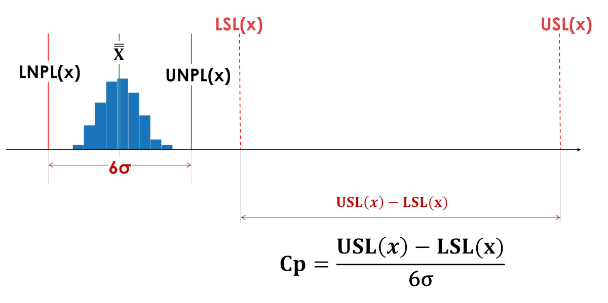
The living space index (Cp) does not say where the process is located relative to the tolerance limits, inside or even entirely outside the tolerance boundaries. The living space indices Cp in Figures 3 and 4 have the same values.
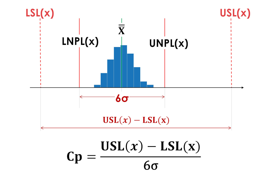
Rice. 3. Indices of actual process reproducibility Cp (process vital space index). LSL(x) - Lower tolerance limit; USL(x) - Upper tolerance limit; LNPL(x) - Lower natural boundary of the process; X - Average of process averages; UNPL(x) - Upper natural bound of the process.
Rice. 4. The process is artificially shifted beyond the tolerance limits.
The centering index Cpk does not give an idea of the side of the offset from the center of the tolerance field, and therefore hides important information for improving the process, and is meaningless if the value does not coincide with the center of the tolerance field (asymmetric tolerance fields).
The centrality indices Cpk in Figures 5 and 6 have the same values.
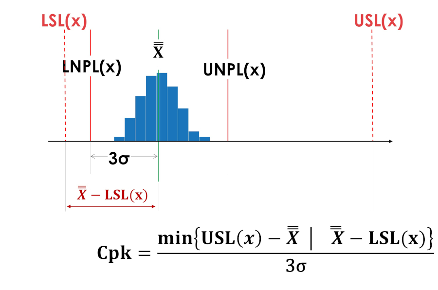
Rice. 5. Centering index Cpk of a process shifted to the lower limit of the tolerance field.
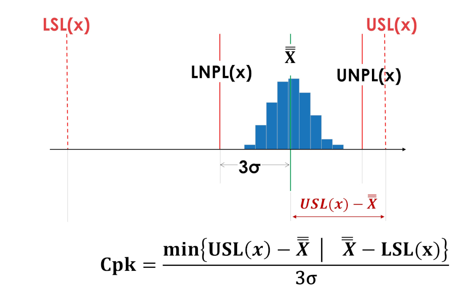
Rice. 6. Centering index Cpk of a process shifted to the upper limit of the tolerance field.
And again, much more useful information about the process and what needs to be done to improve it, understandable to everyone, is provided by simple graphical methods: Shewhart control charts, a distribution histogram and a simple dot plot of controlled values supplemented by tolerance limits.
For example, imagine that you were told the following reproducibility index values: Cp=2.6; Cpk=0.9 instead of showing the graphs presented in Figure 7. What information is easier and faster to perceive? What form of information transfer gives a more complete picture of the process?
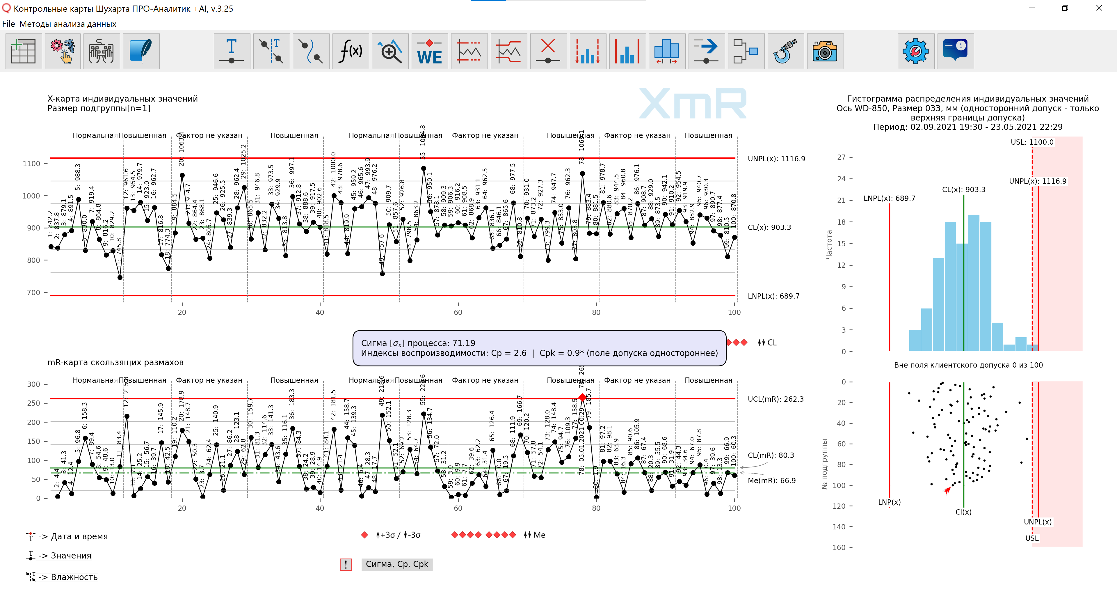
Rice. 7. What information is easier and faster to perceive? What form of information transfer gives a more complete picture of the process?