Rational grouping of data for effective use of control XbarR-charts of averages and ranges of subgroups
Source: Article kindly provided to us by Dr. Donald Wheeler: [35] Rational grouping. Conceptual foundations of process behavior diagrams / Rational Subgrouping. The conceptual foundation of process behavior charts, Donald J. Wheeler.
Translator and scientific editor: Sergey P. Grigoryev
Free access to articles does not in any way diminish the value of the materials contained in them.
An important aspect of using control charts effectively is their ability to answer the right questions. To do this, the method of distributing data into subgroups must correspond to the structure of the data. This usually means that data from some “small area” - space, time, production batch - should be grouped into each subgroup so that the data within the subgroup is as homogeneous as possible. The emphasis on minimizing variation within subgroups stems from the fact that it is this variation that is used in calculating control limits. Control limits depend on the mean range, which in turn depends on the individual group ranges, which reflect variation within subgroups. It is the variation within subgroups that is used to set control limits, which determine how much variation is acceptable between subgroups.
The question posed by the mean control chart is: “Do group means vary more than they should, based on within-group variation?” In other words: “Given variability within subgroups, are differences between group means detectable?”
The subgroup range chart asks, “Is the variation within subgroups consistent from subgroup to subgroup?” Or, to put it another way: “Given the assumption of average variation within subgroups, are the differences in variation across subgroups detectable?”
The difference in these two questions will be illustrated by several examples.
Sheet thickness
The 30-inch (762 mm) wide vinyl sheet used to make the padded panel sheathing was extruded under the control of an automatic process controller. The input device for this automatic process controller was a traditional beta scanner that measures vinyl thickness. The engineer wanted to study the thickness readings along one track located 10 inches from the left edge of the vinyl sheet, so he collected all the data for that track and plotted it on an XbarR subgroup mean and range reference map, using subgroups of size four.
By using a subgroup of size four, he ensured that each subgroup would represent about two minutes of process work. In his opinion, this allowed normal variations (random variations due to common causes) to appear in the extrusion process in each subgroup. The average control chart in Figure 1 shows that the automatic controller adjusted the process up and down in cycles of about 20 minutes. Although the average thickness was 48.5mm, it could be 49.5mm in five or six minutes before dropping to 47mm after six minutes. This change in thickness affected how the vinyl would heat and stretch when vacuum formed. This change in thickness created waste in the next step, but on average the vinyl was the right thickness!
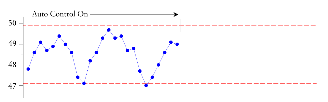
Rice. 1. XbarR control chart of average thickness subgroups of vinyl sheets during automatic control.
Points within the control limits are trending up and down to tell us that this automatic process controller is not enough damped , is not maintaining a good steady-state response and needs help. According to the engineer who created this XbarR control card, it's easy to "recognize the sine wave" we're seeing. Based on the observed phenomenon in Figure 1, the engineer turned off the automatic process controller. Over the next 45-minute period, it received new values, shown on the right in Figure 2.
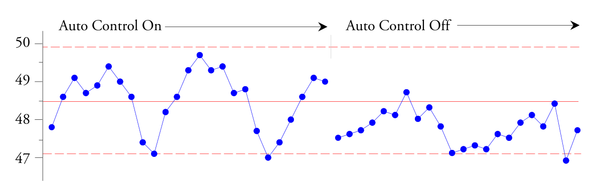
Rice. 2. Control XbarR-chart of average thickness subgroups of vinyl sheets (continued).
This confirmed that approximately half of the variation in sheet thickness was due to the automatic process controller. Because these variations result in defective output, this automatic process controller must be properly configured to eliminate these 20-minute cycles. Notice how the path from interpreting the graph to formulating the required action depends on both the context of the data and how the data is organized into subgroups.
Time to maximum torque
To characterize the curing properties of batches of rubber compound, a sample from each batch must be tested in the laboratory. This test measures the torque of a rubber sample as it cures. The test result was the curing time required to achieve maximum torque. Since each of the three operators produced five loads of rubber per shift, the laboratory decided to use the five daily values for each operator as their subgroups. This resulted in one subgroup per shift, with the variation within a subgroup being the batch-to-batch variation for each operator, and the variation between subgroups being the operator-to-operator and day-to-day variation. Since all operators produced the same product using the same rubber mill, we expected to see a predictable process when constructing the XbarR-chart of subgroup means and ranges.
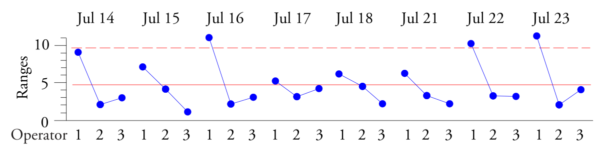
Rice. 3. Control R-map of subgroup ranges for time to maximum torque.
The R-map of group ranges shows a repeating high-low-low pattern. The batches produced by Operator 1 show more variation than the batches produced by Operators 2 and 3. Although Operator 1 was a senior operator with 30 years of experience, he did not mix his batches properly. It turned out that this was because Operator 1 was losing his vision and couldn't see well enough to mix manually.
Once again, the key to interpreting data is organizing the data on a control chart. The XbarR control chart of group ranges shows the lack of consistency within subgroups, and identifying each subgroup with a single statement allows us to understand the pattern shown in Figure 3. It is the organization of the data that determines what issues will be addressed in the XbarR control chart of subgroup means and ranges. Location changes that occur between subgroups will be displayed on the X-map of subgroup means. Changes in variation that occur within different subgroups will be shown in the R-map of group ranges. In each case, it is the variation within the subgroups that determines the criterion for detecting any differences that arise. Understanding this is the key to effectively analyzing observational data.
In the first example above, it was a sequential circuit offering a simple experiment to disable an automatic process controller. In the second example, it was an approach that matched the data structure, which led to the discovery of a blind operator. In both cases, interpretation of the diagrams in their context led to discoveries. The willingness to think this way, which is consistent with the way data is collected and constructed, cannot be programmed. It depends on someone taking the time and effort to look at the charts and think about them. This has always been and will always be an integral part of the effective use of process behavior control charts.
For some data sets, rational subgrouping will be quite simple. However, for some data sets there may be more than one possible way to split the data into subgroups. The following example falls into this category.
Injection molded joint heads
Injection molding is used to make the swivel joint four pieces at a time. At the time of collection of this data, this manufacturing method represented changes in both materials and technology. Therefore, before launching into mass production, it was necessary to undergo process certification. Dave, the manager, decided to use process behavior checklists to evaluate the process prior to certification.
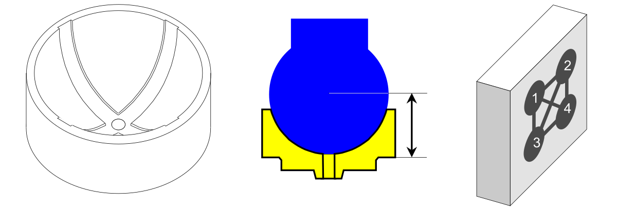
Rice. 4. Ball coupling, thickness size and mold having 4 cavities.
Since there was only one mold, only one press and only one operator were involved in the certification process. The data was the effective thickness of the ball coupling, measured in hundredths of a millimeter. Because one side of the ball coupling was concave, a special gauge had to be designed and manufactured to measure this thickness. Gauge measurements show a thickness exceeding 12.00 millimeters. Four times a day, Dave went to the press and collected parts produced by five consecutive press cycles. Because each cycle produced four parts (one from each cavity), he had to measure 20 parts every two hours. Using caution, Dave kept track of the cycle and the cavity from which each part came.
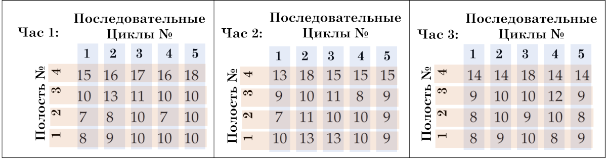
Rice. 5. Structure of hourly ball coupling thickness data. Hour, Consecutive Cecles, Cavity.
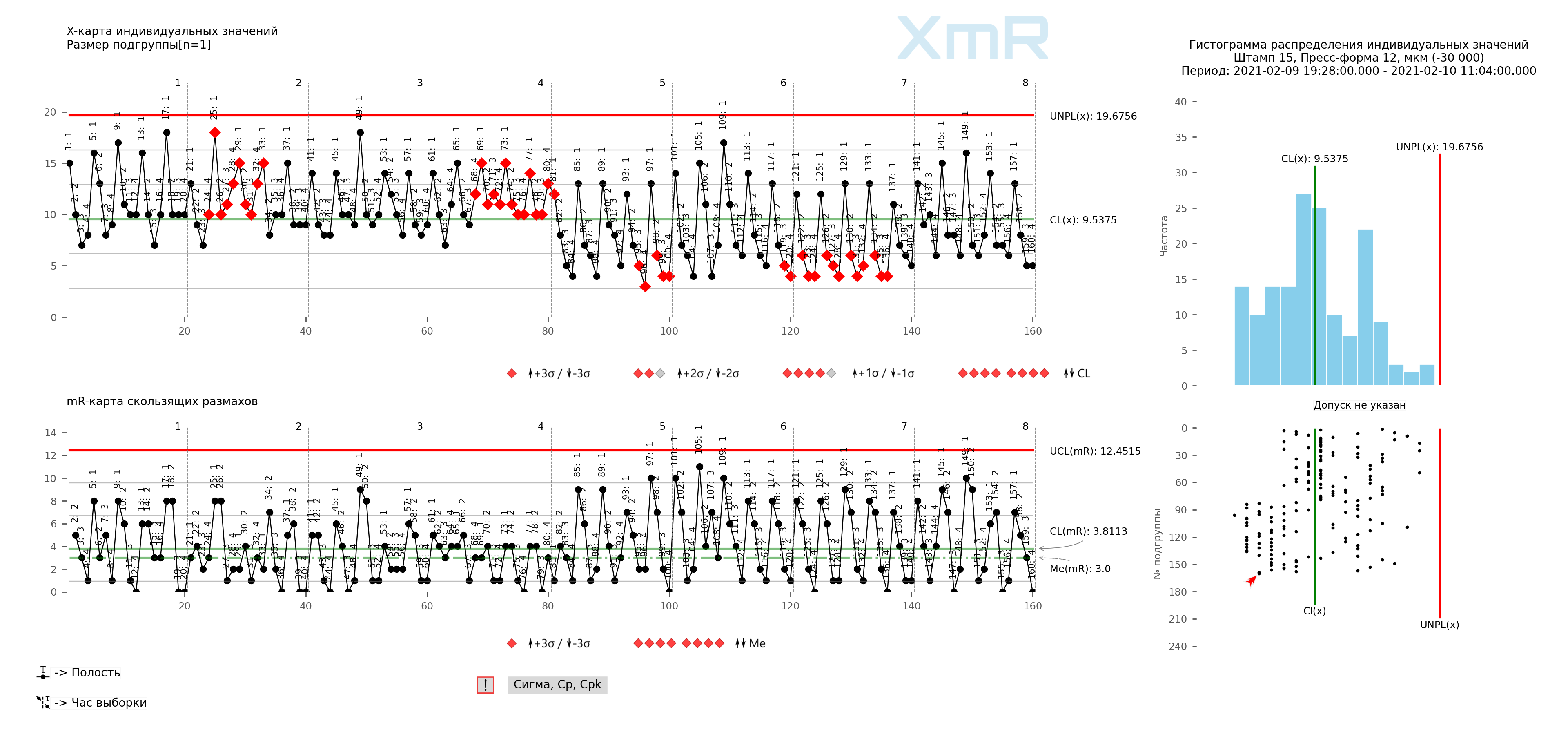
Rice. 6. Structure of hourly data on the thickness of the ball coupling, on the process progress chart (XmR chart of individual values and sliding ranges). Vertical dividers: Hour, signatures of all points: Mold cavity. The drawing was prepared using our developed “Shewhart control charts PRO-Analyst +AI (for Windows, Mac, Linux)” .
There are three identifiable sources of variation in these data. There is hourly variation, which is represented by different sets (blocks) of 20 values in Figure 5. There is cycle-to-cycle variation, which is represented by different columns in Figure 5 (1, 2, 3, 4, 5). And there is a variation from cavity to cavity, which is represented by different lines in Figure 5 (1, 2, 3, 4).
We will look at the different ways to group them for the XbarR control chart of subgroup means and ranges, as well as the impact of each organization of data into subgroups on the interpretation of the control charts. For the certification process, Dave collected data for six days. For brevity, we will only use data from the first two days.
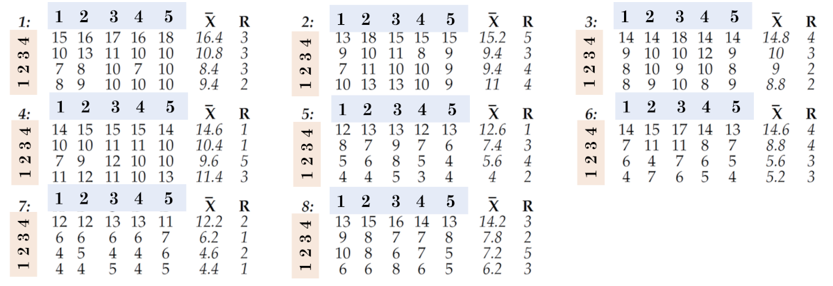
The full data set and the first organization into subgroups are shown in Figure 7. Each column of four values is used to define a subgroup, so that our 160 values are organized into 40 subgroups of size n=4. Data for different hours (1, 2, 3, etc.) are in different subgroups. When you change hours, you change subgroups. Therefore, in this first organization of the data into subgroups, it can be said that hourly differences (as well as daily differences) appear between subgroups. Here the XbaR average chart will ask the following questions:
Question #1: Are there noticeable differences between hours or days?
In Figure 8, data from different cycles (1, 2, 2, 4, 5) are in different subgroups. When you change cycles, you change subgroups. Therefore, it can be said that cross-cycle differences appear between subgroups in this first organization of these data. Here the mean subgroup chart will also ask the following question:
Question #2: Are there any noticeable differences between the cycles?
In Figure 8, data from different cavities (1, 2, 3, 4) are in the same subgroup. When you change cavities, you don't need to change subgroups. Therefore, it can be said that differences between cavities appear within subgroups in this first organization of these data. So here the group range chart will ask the following question:
Question #3: Are the differences between the cavities consistent?
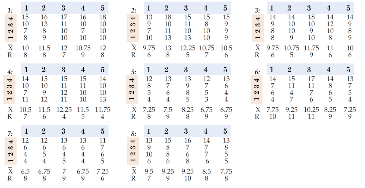
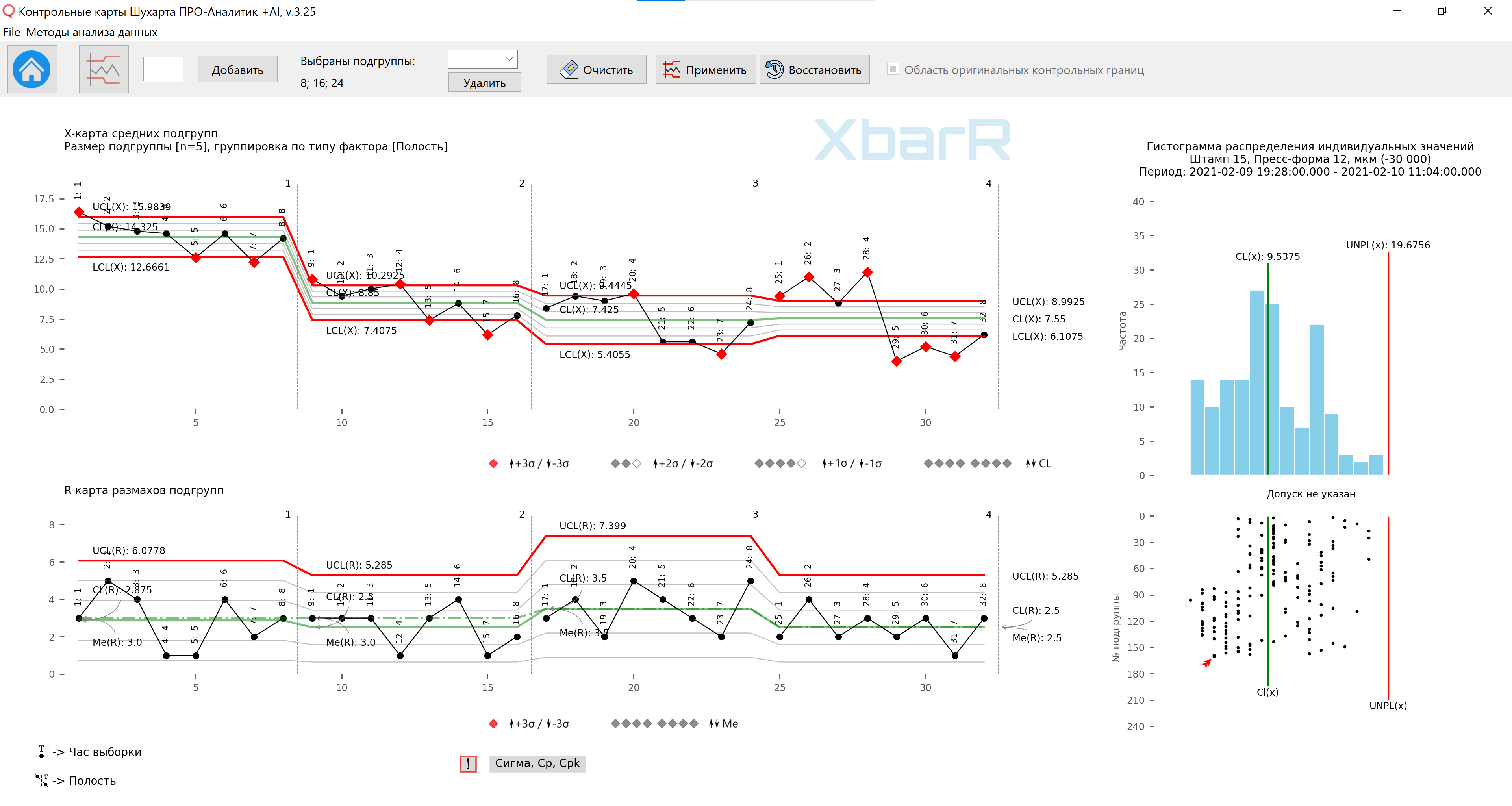
Rice. 7. The first way to organize data into subgroups.
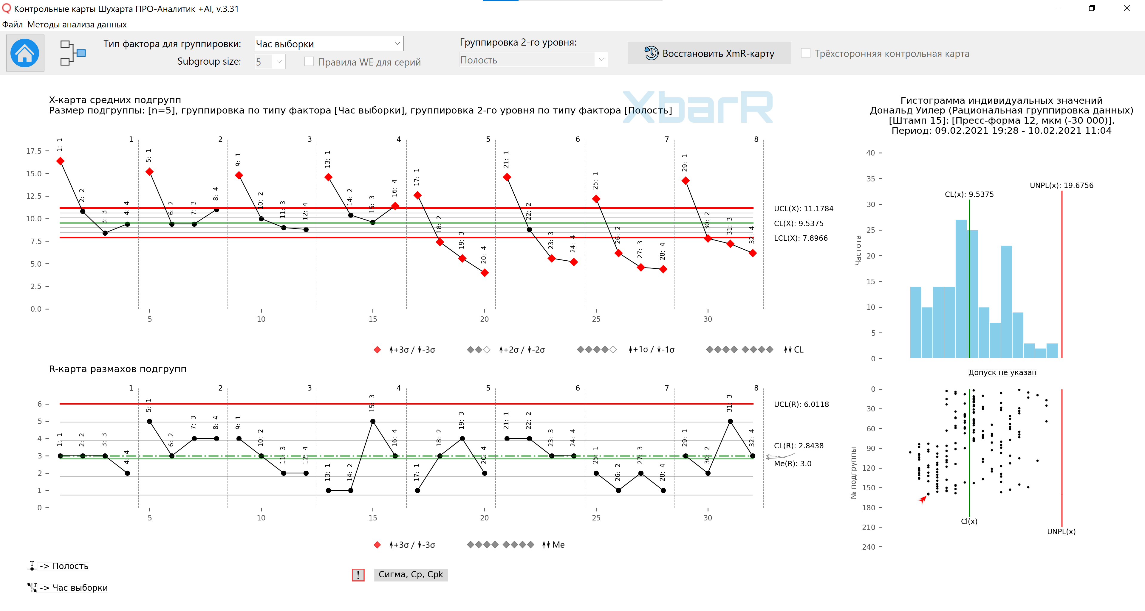
Average value - 9.54; the average range is 7.63, resulting in the control limits shown in Figure 8. By breaking the line of the graph, we make it easier to read by giving our eyes a reference to each hour separately. Although no point falls outside the limits, there is a clear signal in the subgroup average plot. When 20 out of 20 averages are above the center line, followed by 19 out of 20 below the center line, there is a real difference between days one and two. The subgroup range chart can also display daily differences. So we answer question #1 (Are there noticeable differences between hours or days?) with a definitive yes, we answer question #2 (Are there noticeable differences between cycles?) with a negative, and answer question #3 (Are the differences consistent? between cavities?) probably “no”.
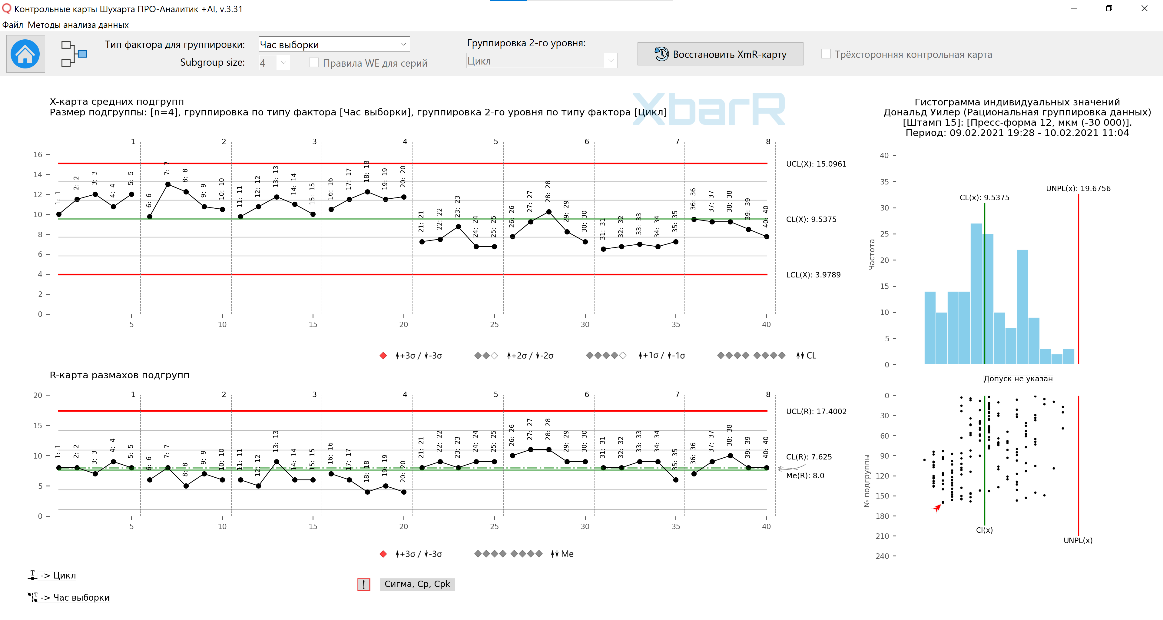
Rice. 8. Map of averages and ranges of subgroups for the first method of organizing data in subgroups. Vertical lines dividing series with values from 1 to 8 - Hours of sampling, signatures of all points - Cycle No. The drawing was prepared using our developed “Shewhart control charts PRO-Analyst +AI (for Windows, Mac, Linux)” using a unique automation functions for rational data grouping to construct an XbarR-chart of the means and ranges of subgroups by the selected type of sources of variation (column with factors) and the size of the subgroups.
The second way to organize data into subgroups
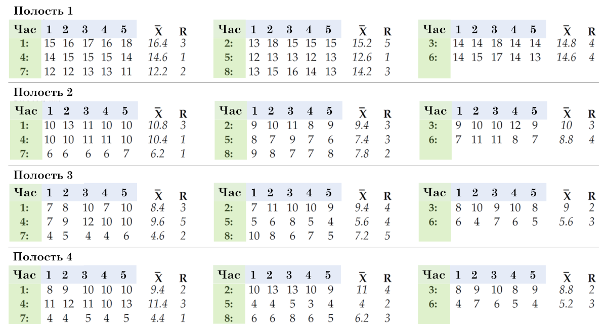
A second way to organize this data is shown in Figure 9. There, each row of five values is used to define a subgroup, so we end up with 32 subgroups of size n=5. Here, data from different clocks (1:, 2:, 3:, etc.) are in different subgroups. When you change hours, you change subgroups. Therefore, in the second organization, hourly (and daily) differences can be said to emerge between subgroups. Here the mean subgroup chart will ask the following question:
Question #4: Are there noticeable differences between hours or days?
In Figure 9, data from different cycles (1, 2, 3, 4, 5) are in the same subgroup. When you change cycles, you don't need to change subgroups. Thus, it can be said that cross-cycle differences appear within subgroups in the second organization of these data. Here the group range diagram will ask the following question:
Question #5: Are the differences between cycles consistent?
In Figure 9, these different cavities (1, 2, 3, 4) are in different subgroups. When you change cavities, you change subgroups. Thus, it can be said that differences between cavities appear between subgroups in the second organization of these data. Here the subgroup average plot also asks the following question:
Question #6: Are there noticeable differences between the cavities?
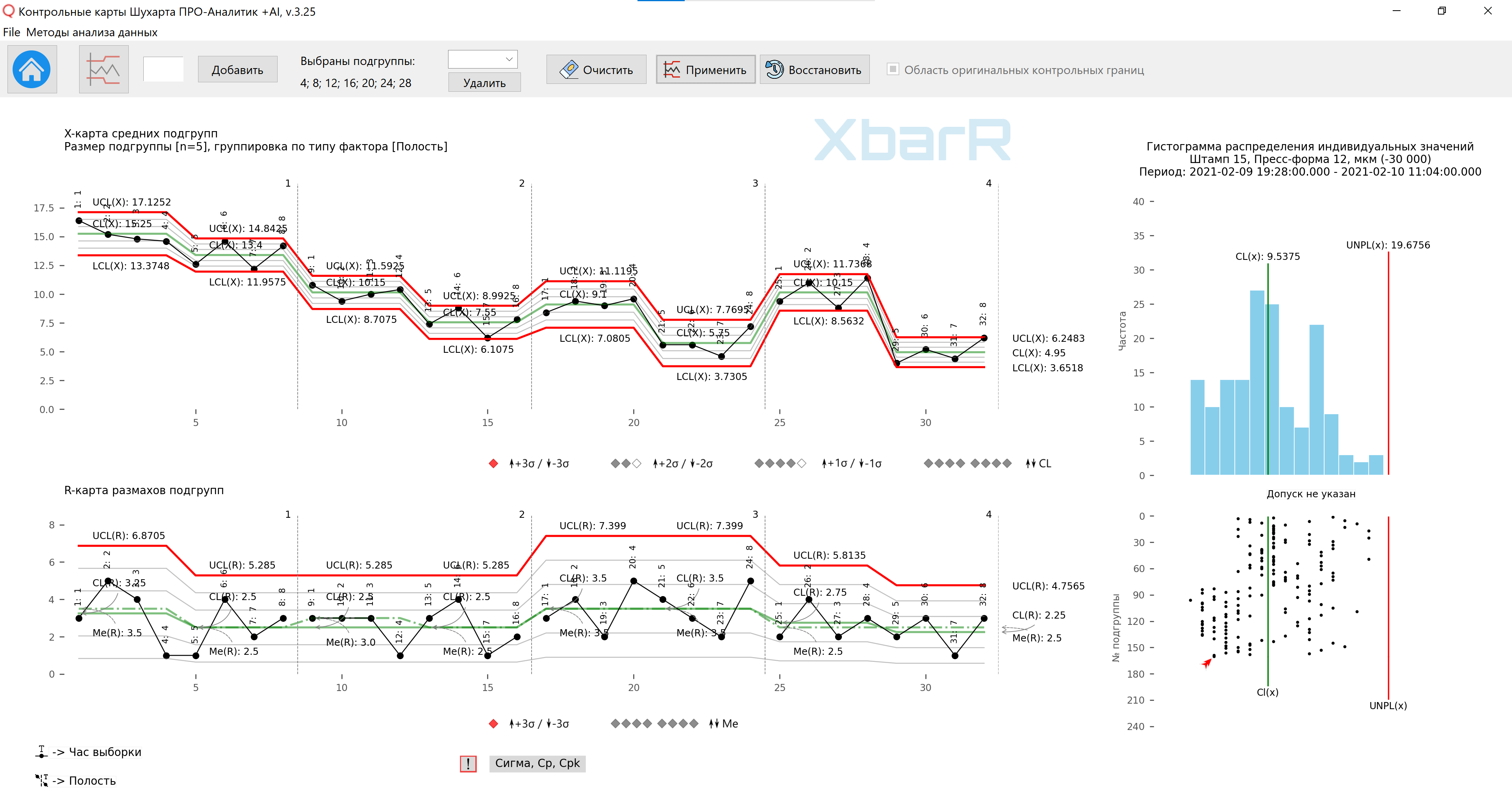
Rice. 9. The second way to organize data into subgroups.
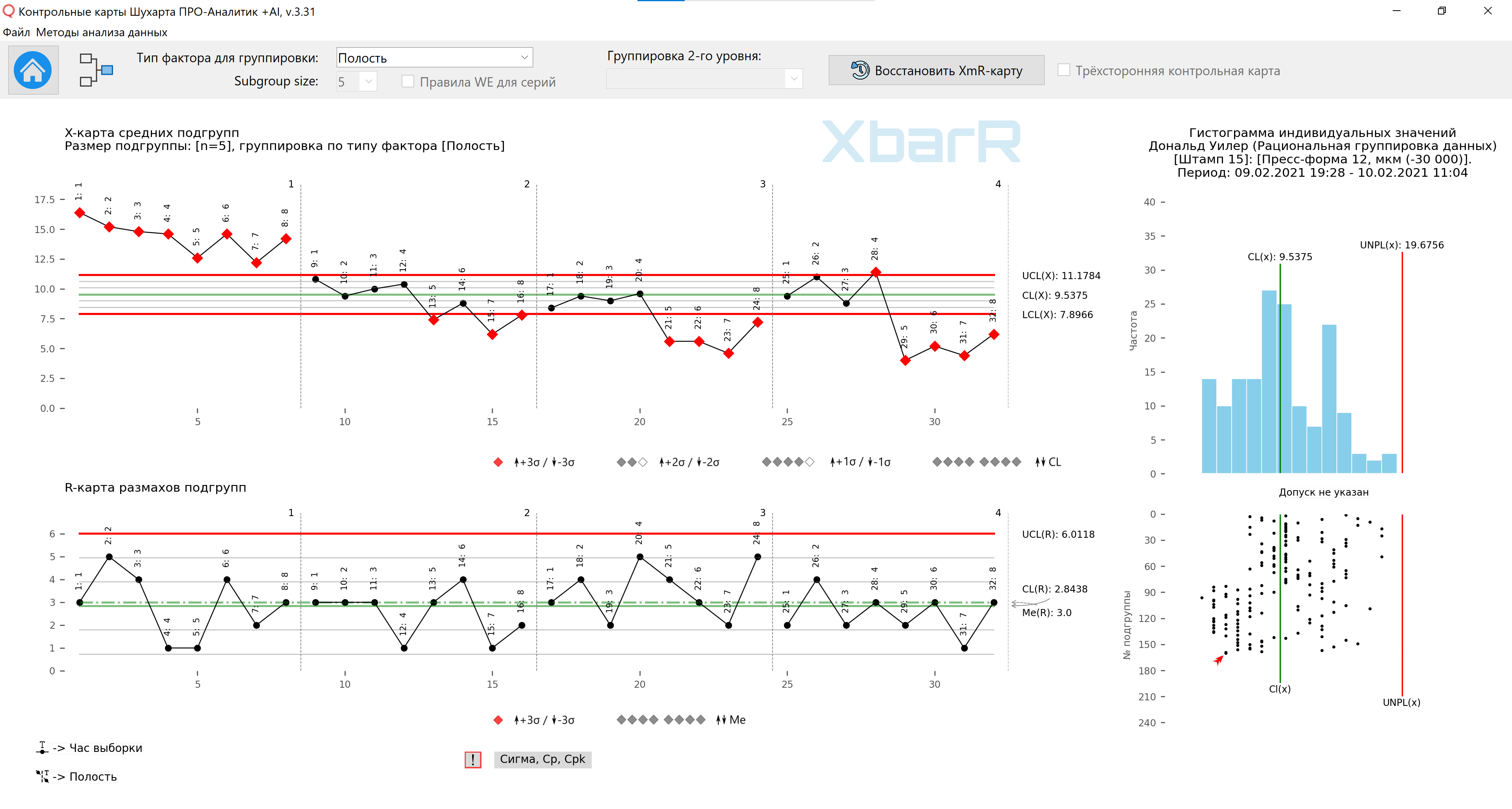
Average value - 9.54; the average range is 2.84, resulting in the control limits shown in Figure 10. Since 20 of our 32 averages are outside the control limits, we have plenty of signals to interpret. There are noticeable differences between the two days and there are noticeable differences between the four cavities. Moreover, the change from cycle to cycle appears to be consistent from subgroup to subgroup (R-map of subgroup ranges).
Rice. 10. Diagram of means and ranges of subgroups for the second method of organizing data in subgroups. Vertical lines dividing series with values from 1 to 8 are the hours of sampling. Signatures of all points - Cavity No. The drawing was prepared using our developed “Shewhart control charts PRO-Analyst +AI (for Windows, Mac, Linux)” using a unique automation functions for rational data grouping to construct an XbarR-chart of the means and ranges of subgroups by the selected type of sources of variation (column with factors) and the size of the subgroups.
Both of the above organizing data into subgroups are technically correct, but in practice they are not the same because they do not ask the same questions of the data. To understand this difference, consider question #3 and question #6.
The first organization of the data resulted in question #3: “Are the differences between cavities consistent?” The group range chart in Figure 8 answered this question in the affirmative. The differences between the cavities are constant.
The second organization resulted in question #6, which asked, “Are there noticeable differences between the cavities?” The chart of average subgroups in Figure 10 answered this question in the affirmative. There are noticeable differences between the four cavities. Cavity (1) produces thicker parts than other cavities.
Until you understand the difference between Question #3 and Question #6, and until you understand how to use that difference to answer your questions, you will not understand rational subgrouping. This is a skill that requires practice and thought. You can practice by answering the questions in the next section.
The third way to organize data into subgroups
Dave did not use any of the previous organizations of data into subgroups. Instead, he used the method of organizing data into subgroups, shown in Figure 11, for his certification test. We again use each row of five values as a subgroup of size five, so the subgroups are the same as in the second organization, but now we organize them differently. Instead of one chart with 32 subgroups, we will have a separate chart for each cavity.
In Fig. 10, while fixing the cavity and cycle, do you change subgroups from hour to hour?
So can hourly differences be found within subgroups or between subgroups?
So where will the hourly differences appear: on the range chart or on the subgroup mean map?
In Figure 10, with a fixed clock and cavity, do you change subgroups as you move from cycle to cycle?
So can we find differences between cycles within subgroups or between subgroups?
So, where will the inter-cycle differences appear: on the range chart or on the average map?
In Figure 10, with fixed clocks and cycles, do you change subgroups as you move from cavity to cavity?
So where can you find the differences between cavities?
So where will the differences between the cavities appear?
Rice. 11. The third way to organize data into subgroups.
Rice. 12. Map of averages and ranges of subgroups for the third method of organizing data in subgroups. Vertical lines dividing series with values from 1 to 4 - No. of Cavities. Signatures of all points - Sampling hour. The drawing was prepared using our developed “Shewhart control charts PRO-Analyst +AI (for Windows, Mac, Linux)” using a unique automation functions for rational data grouping to construct an XbarR-chart of the means and ranges of subgroups by the selected type of sources of variation (column with factors) and the size of the subgroups.
By plotting all four diagrams on the same vertical scale, we will show the differences between the cavities. Obviously, cavity (1) makes the parts thicker, and cavity (2) is slightly thicker than cavities (3) and (4). Based on these graphs, Dave knew he needed to make adjustments to the form. Since cavities (3) and (4) were fairly well centered within the tolerance range, he asked the tool shop to place shims behind cavities (1) and (2).
What source of variation is found in span diagrams? Watch? Cycles? Cavities?
What source of variation is found in average charts? Watch? Cycles? Cavities?
So what do the points outside the control limits on the average charts above mean?
If you had problems with the previous questions, you may need to read this article again.
You can continue processing the control chart data from Figure 12 and, using the run-by-run control limit function, divide the data runs into individual cavity areas based on visible features, obtaining confirmation of the functioning of the various processes before and after mold cleaning.
Rice. 13. Map of subgroup means and ranges for the third method of organizing data in subgroups with control limits for individual series of points. Vertical lines dividing series with values from 1 to 4 - No. of Cavities. Signatures of all points - Sampling hour. The drawing was prepared using our developed “Shewhart control charts PRO-Analyst +AI (for Windows, Mac, Linux)” using a unique automation functions for rational data grouping to construct an XbarR-chart of the means and ranges of subgroups by the selected type of variation sources (column with factors) and the size of subgroups using the function constructing control limits for individual series of subgroups .
Rice. 14. Map of subgroup means and ranges for the third method of organizing data in subgroups with control limits for individual series of points. Vertical lines dividing series with values from 1 to 4 - No. of Cavities. Signatures of all points - Sampling hour. The drawing was prepared using our developed “Shewhart control charts PRO-Analyst +AI (for Windows, Mac, Linux)” using a unique automation functions for rational data grouping to construct an XbarR-chart of the means and ranges of subgroups by the selected type of variation sources (column with factors) and the size of subgroups using the function constructing control limits for individual series of subgroups .
Summary. Organizing data into subgroups
While all three ways of organizing this data into subgroups are technically correct, they are not practically equivalent. Different organizations ask different questions about data and make different assumptions about data.
The first way to organize the data into subgroups in Figures 7 and 8 tests consistency from cavity to cavity and looks for differences between clocks and cycles.
The second way to organize the data into subgroups in Figures 9 and 10 tests consistency from run to run and looks for differences between clocks and between cavities. Why is this organization more sensitive than the first?
The third way to organize the data into subgroups in Figures 11 and 12 also tests cycle-to-cycle consistency and looks for differences between hours and between cavities, but by placing the cavities on separate charts (Figure 12), it is easier to identify hourly and daily differences in the process. Of the three ways to organize this data, the third is best.
Clever data grouping
The key to getting answers to your questions in a chart of subgroup means and ranges is to understand how the two parts of the XbarR-chart ask different questions. You control the issues by which sources of variation you place within subgroups and which sources of variation you place between subgroups. Things that may be different from each other should be in different subgroups. Things that can be the same must be in the same subgroup.
When we place, for example, two measurements together in the same subgroup (n=2), we conclude that the two values were obtained under essentially the same conditions. It is this element of judgment that makes your subgroup rational. Without such judgment, your subgroup may well be irrational.
You should never deliberately group dissimilar things together. Each subgroup must be logically homogeneous. If you put apples, oranges and bananas together, you might end up with a good fruit salad, but you'll end up with bad subsets. Luckily, the scope chart can alert you when you systematically group different things into subgroups. Figure 15 shows the range chart from Figure 8. There we had all four cavities in each subgroup.
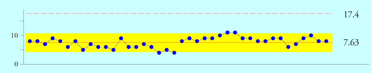
Rice. 15. Map of subgroup ranges for the first method of organizing data into subgroups.
The highlighted band in Figure 15 is the one-sigma band. We expect 60 to 75 percent of the range values to fall within this range. Here we get 36 out of 40, which is 90 percent within one sigma of the center line. When group spans span the center line, it indicates the presence of subgroups of dissimilar things grouped together. A common sign of this phenomenon is 15 consecutive swings within one sigma of the center line of the swing map. If you find this, check for possible stratification within subgroups. To understand how stratification within subgroups affects the mean map, compare the control limits of the mean chart in Figure 8 (mostly LCL=4 to UCL=15) with those in Figure 10 (mostly LCL=8 to UCL=11).
Minimize variation within subgroups. Background noise levels are determined by variations within subgroups. Any signals will have to be looked for against this background of noise. By minimizing variation within subgroups, you maximize the sensitivity of the process behavior control chart.
Maximize the opportunity for variation between subgroups. This requires thinking about what types of potential signals might arise in your data stream. If you want to compare two things, they need to be placed in different subgroups. If it is possible that two things could be different, they should belong to different subgroups.
Don't bury signals within subgroups. Grouping is effective only to the extent that the subgroups remain homogeneous. In many areas of statistics where parameter estimation is the goal, large volumes of data are preferred. But this does not apply to XbarR-charts of average and range subgroups. Increasing the size of a subgroup is a good way to break up the homogeneity of subgroups. Since the calculations explicitly assume internal homogeneity of subgroups, the logical homogeneity of subgroups is much more important than the size of the subgroup.
Respect the context of your data. Context defines the structure of your data and is key to discovering specific causes of variation when you change your process. Even the order of subgroups can matter. This is why we usually use time order for the graph. However, you can use other orders if they make sense in the context of the data.
Security Question
Which implicit assumption in Figures 8 and 10 was incorrect?
Our software “Shewhart control charts PRO-Analyst +AI (for Windows, Mac, Linux)” already contains a prepared Excel file with data for this article.