Distortion of product quality control data through substitution of values that do not fit into the tolerance range. Eliminate the fear-based control system!
Material prepared by: Scientific Director of the AQT Center Sergey P. Grigoryev .
Free access to articles does not in any way diminish the value of the materials contained in them.
In a company that produces products using thermo-vacuum pressing, successive subgroups of five parts are selected for inspection five times a day. One mold has only one shape (each press cycle produces one part). Based on the results of measuring a key quality characteristic, inspectors record only the minimum and maximum values. The tolerance range for this part is 18.19 - 18.27 mm. The measuring device made it possible to record measurement values with an accuracy of up to the 3rd decimal place (up to thousandths), but when recording, all data was rounded to hundredths.
Inspectors should make records for all inspected products in a subgroup of five products (n=5) and build an XbarR-chart of the averages and ranges of the subgroups, but record the minimum and maximum values in the subgroup (2 out of 5) , this is all that was at the time of contacting us.
The first thing you need to do when analyzing any data is to build a simple chart of the progress of the process based on it, as Donald Wheeler, the author of the book, constantly reminds us of. Statistical process control. Business optimization using Shewhart control charts .
Using the provided data, we built a control XmR-chart of individual values with a distribution histogram and a scatter plot, and obtained graphs that exactly resembled (Figure 1).
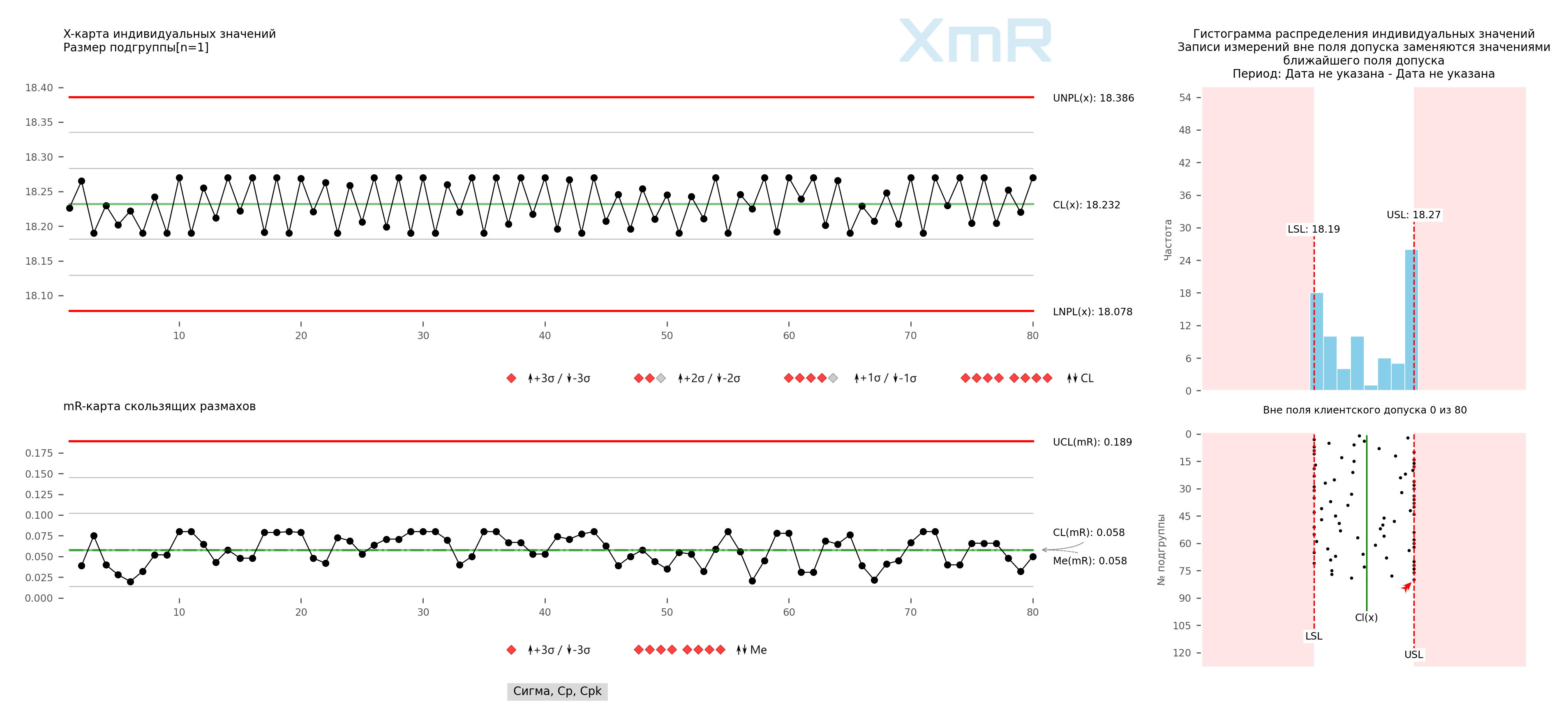
Figure 1. XmR control chart of individual values with histogram and scatter plot. Legend: UNPL - upper natural control limit of the process, LNPL - lower natural control limit of the process, CL - central line (average). LSL - lower tolerance limit, NSL - nominal tolerance field and USL - upper tolerance limit. The drawing was prepared using our developed “Shewhart control charts PRO-Analyst +AI (for Windows, Mac, Linux)” .
The control XmR-chart of individual values demonstrates strange behavior of the process; almost all points were in the +/-1 sigma zone from the central line CL(x), which in our case is quite understandable, because the width of the control limits of the XmR-chart is determined by the average value of all moving ranges between the values of two points, which represent alternating minimum and maximum values of the subgroups.
Greater clarity of what is actually happening was clearly shown by the histogram and scatter plot of the distribution of individual values (Figure 1).
What don't you see in the histogram (Figure 1)?
During World War II, the command of the American and British Air Forces assigned Abraham Wald, who worked in the secret program of the Statistical Research Group (SRG), USA, to find out which parts of the aircraft fuselage needed to be protected with additional armor. The military proposed installing additional protection on those parts of the aircraft that suffered the most during air battles. Wald studied planes returning from combat missions, noting the locations of hits. As a result, he recommended installing additional protection in those areas (central and rear parts of the fuselage) where the number of holes, on the contrary, was minimal. The recommendation was based on the conclusion that it was necessary to protect against hits that Wald did not see - the planes that received them simply did not return. Subsequently, decisions made based on the analysis of only known data were called “Survivorship bias.”
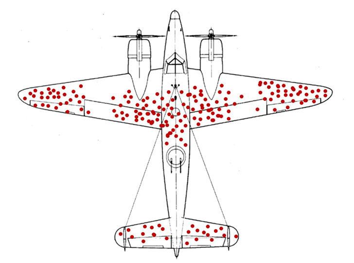
Figure 2. "Airplane". Abraham Wald. Survivorship bias.
If the failure of the histogram columns in the center of the tolerance field (Figure 1.) can be explained by the absence of records of 3 out of 5 values in the controlled subgroup, then how can we explain the almost complete absence of points outside the tolerance limits, despite the fact that the highest histogram columns are at the tolerance boundaries ? The absence of any data tails outside the tolerance limits may indicate that such data is not recorded in the records, while the accumulation of points at the tolerance limits indicates the replacement of such “bad” values with acceptable ones. For example, if the minimum value in a subgroup is less than the lower tolerance limit, controllers record the value of the lower tolerance limit, if the maximum value in the subgroup is greater than the upper tolerance limit, controllers record the value of the upper tolerance limit.
Among other things, the scatter plot determined a high degree of data discreteness; data is rounded by controllers to the nearest hundredth. See the explanation in the article: Construction of Shewhart control charts using inadequate units of measurement leads to erroneous conclusions .
To test this hypothesis, we generated random values using a normal distribution of 40 subgroups of size n=5 (200 individual values), with a mean value of 18.23 at the center of the tolerance zone and a sigma value of 0.03, which can result from the manipulations described above results similar to those in Figure 1. We constructed a control XmR-chart of individual values with a histogram and scatter plot from these data (Figure 3).
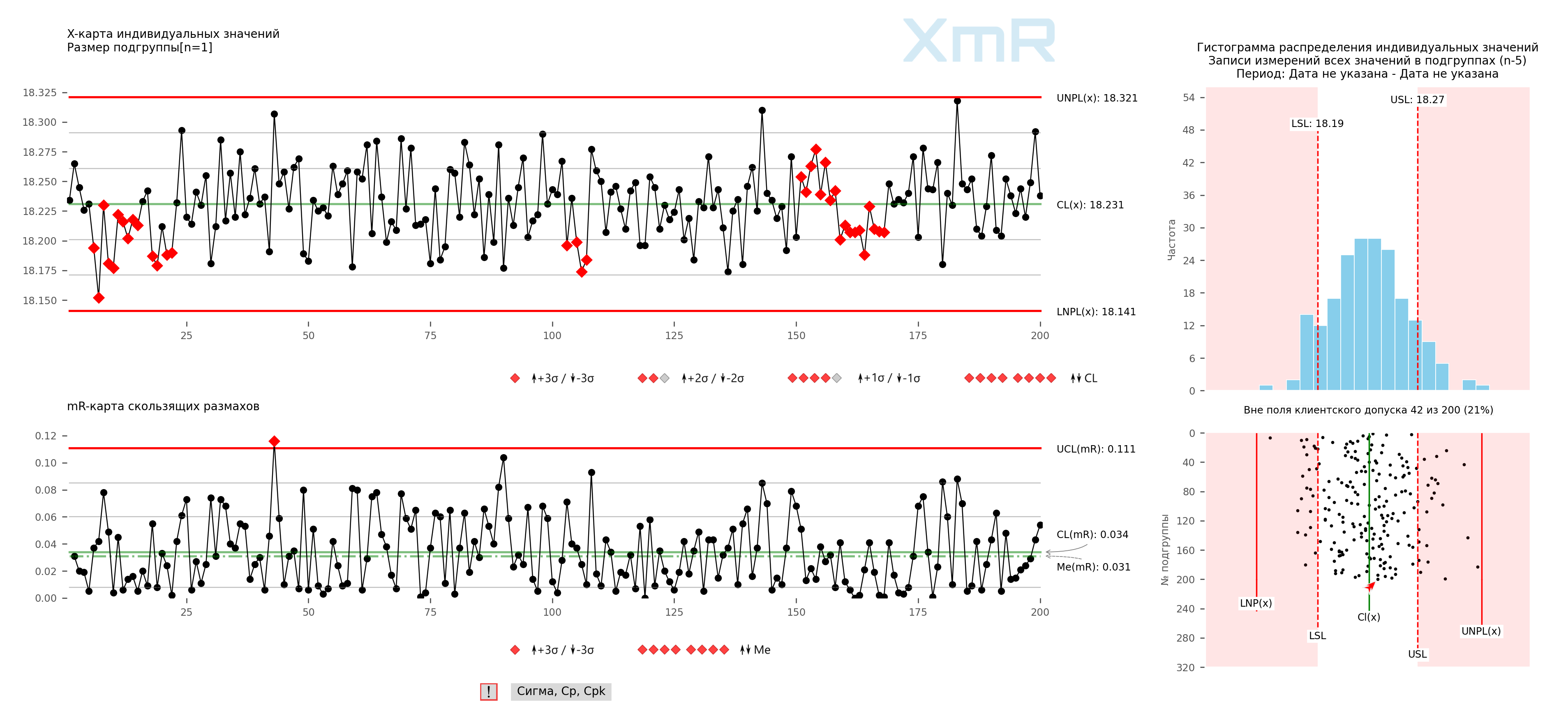
Figure 3. Control XmR-chart of individual values with distribution histogram and scatter plot of individual values for generated data from 40 subgroups of size n=5. The drawing was prepared using our developed “Shewhart control charts PRO-Analyst +AI (for Windows, Mac, Linux)” .
At the next step, in each subgroup we selected only the minimum and maximum values in each of the forty subgroups and based on them we built a control XmR-chart of individual values with a distribution histogram and a dot plot (Figure 4).
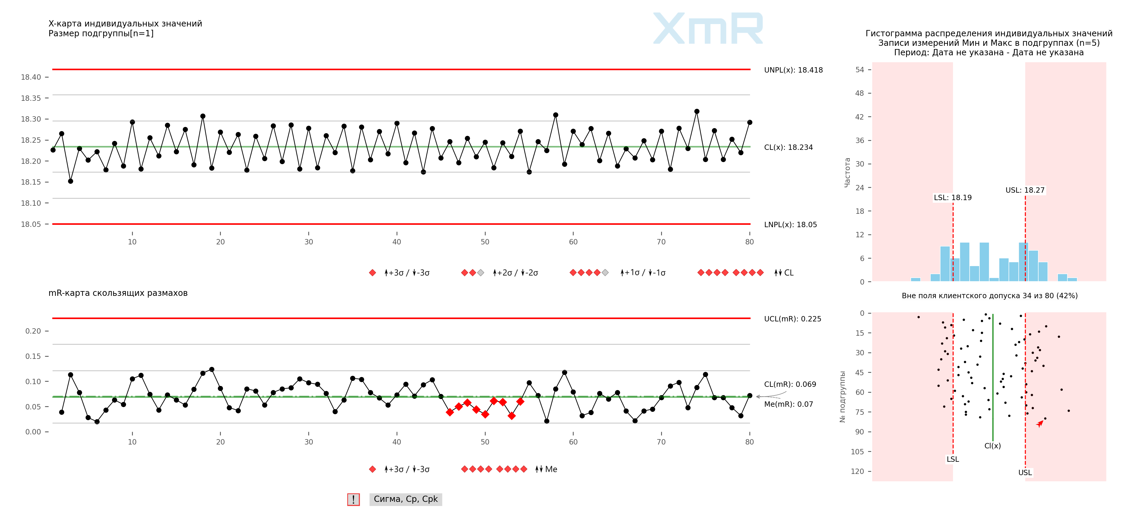
Figure 4. Control XmR-chart of individual values with a distribution histogram and a scatter plot of individual values for generated data from 40 subgroups of size n=5, with only the minimum and maximum values from each subgroup selected. The drawing was prepared using our developed “Shewhart control charts PRO-Analyst +AI (for Windows, Mac, Linux)” .
In the next step, we replaced the minimum and maximum values using the following rule:
- if the minimum value in the subgroup is less than the lower tolerance limit, we replace it with the value of the lower tolerance limit;
- if the maximum value in the subgroup is greater than the upper tolerance limit, we replace it with the value of the upper tolerance limit,
and based on them they built a control XmR-chart of individual values with a distribution histogram and a dot plot (Figure 5).
Figure 5. Control XmR-chart of individual values for generated data from 40 subgroups of size n=5, with selection of only the minimum and maximum values from each subgroup and subsequent replacement of values outside the tolerance range. The drawing was prepared using our developed “Shewhart control charts PRO-Analyst +AI (for Windows, Mac, Linux)” .
Our hypothesis was confirmed.
The management of this company gets what it wants from its subordinates - the release of only high-quality products. Who cares what production actually produces?!
All data for this open solution is included in the software we developed Shewhart control charts PRO-Analyst .
Why is this happening?
Apparently, supervisors are forced to do such things in an attempt to protect workers. There can be no talk of any pride of operators and controllers in their work in such conditions. Improving the quality of manufactured products becomes impossible in such an environment .
Stop managing by fear!
And this is far from a rare case; we see a similar situation very often. In his book “Overcoming the Crisis,” Edwards Deming describes a similar situation at one of the American enterprises:
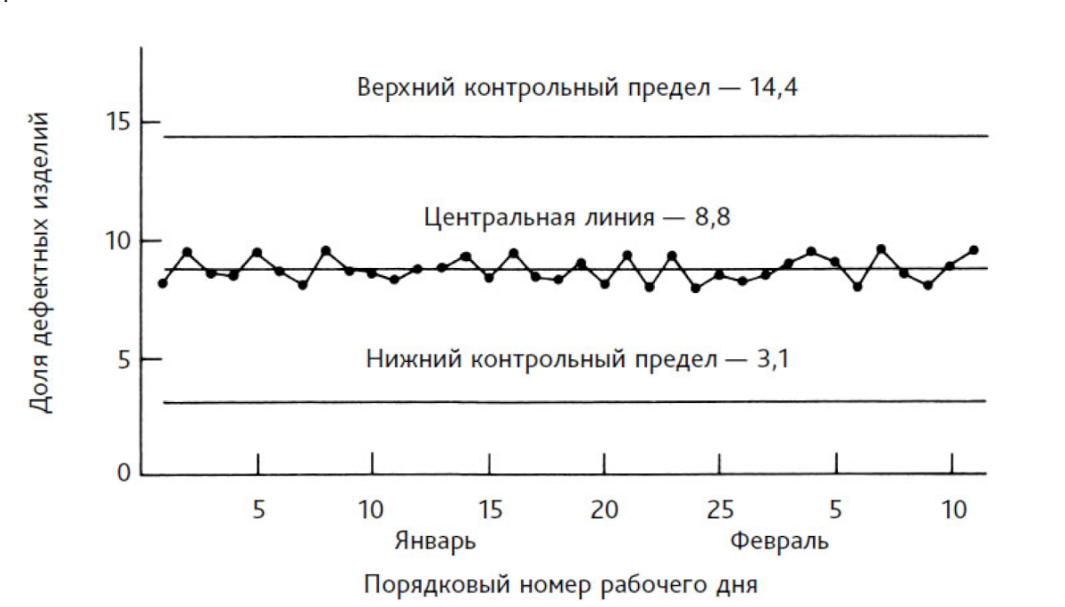
Figure 6. Daily data on the percentage of defective products. 225 products are checked per day. Source: [2] - W. Edwards Deming, “Out of the Crisis”, W. Edwards Deming
Figure 6 shows an interesting situation. The up and down point offset is too small relative to the center line. Two possible explanations for this:
1. The process is designed so that the proportion of defective products is almost constant. In general, this is not uncommon. For example, 12 pallets stamp parts in a circle. One of them fails. The remaining 11 continue to work. The output product will have one defective product for every 12 stampings; 1/12 equals 8.3%, which puts it dangerously close to the average 8.8% on the map.
2. The data shown on the chart does not mean anything.
We (David Chambers and I) rejected the first version, since we know the process and the conditions accompanying it in detail. The second explanation seems more plausible to us. The controller did not feel safe, he was afraid. A rumor spread throughout the plant that the manager would close the plant and fire everyone as soon as the percentage of defective products upon final acceptance reached 10%. The controller was trying to keep 300 people employed.
Wherever fear appears, we will get false numbers. The organization lives in accordance with the ideas that are formed in the heads of its employees. Did this manager actually make such a threat and intend to carry it out? It doesn't really matter. We informed senior management of the explanation we found: fear. The problem disappeared when the plant manager moved to another job and was replaced by a new manager.

"There is no substitute for knowledge. But the prospect of using knowledge is scary."