Evaluating the Measurement Process (EMP) using simple graphical methods
Source: [34] Donald J. Wheeler, Article: "A Better Way to Do R&R Studies. The Evaluating the Measurement Process Approach.." / Donald Wheeler, Article: "A Better Way to Do R&R Studies. Evaluating the Measurement Process Approach." Article kindly provided to us by Dr. Donald Wheeler. Translation and comments: Sergey P. Grigoryev
You can download data for this article.
Free access to articles does not in any way diminish the value of the materials contained in them.
With our software you can conduct assessment of the measurement process (Evaluating the Measurement Process, EMP), which will be clear to everyone you decide to show the results to, from measurement operators to senior management.
In this article, I'll show you how to learn more about the Gage Repeatability & Reproducibility (Gage R&R) of a measurement system from your data with less effort. Instead of getting lost in a series of calculations, the Evaluating the Measurement Process approach Measurement Process (EMP) uses the power of graphical representation of information to reveal interesting aspects of your data.
EMP (Evaluating the Measurement Process) Study
The idea behind EMP research is simple and profound. As my friend and colleague, the late Richard Lyday, put it, “measurement is a process, and with the help of a rational subgroup you can study any process.” An EMP study begins much like an R&R calibration study, but instead of calculating estimates of everything possible, it immediately places the data on an XbarR control chart of subgroup means and ranges to discover what is happening in the data.
See the description of the rational data grouping function in our software:
- Shewhart control charts PRO-Analyst +AI
When we use the XbarR control chart of subgroup means and ranges with experimental data, we are doing something completely different from what we typically do with that control chart. When an XbarR subgroup mean and range chart is used with sequential process progress data, it is properly called a "process behavior chart." There, the goal is to classify a process as predictable or unpredictable. In contrast, in the EMP study we look at the results of a special type of experiment. Here we are trying to determine whether we can detect differences between parts despite the uncertainty caused by measurement error. This shift in both the nature of the data and the nature of our questions will change the way the XbarR-chart of subgroup means and ranges for EMP research is interpreted.
Although the EMP approach can be adapted to many different data structures and data collection schemes, we illustrate a basic EMP study using the same data collection strategy used in calibration testing (Gauge R&R). A simple, fully crossed experiment is performed when two or more operators measure each of three to 10 parts two or three times each. For our example, we will use an EMP study where six operators measured each of four parts three times.
The measurement system consists of a hand-held test bench that measures the electromagnetic property of a specific product. Since this manual test bench is used in production for 100% inspection, it is critical to plant operation. Because six operators routinely perform this test, all six were included in the EMP study. The four parts used in the study were selected from the product stream on one of four different days.
Richard Lyday typically collected his data in two or three rounds, with each operator measuring each part once in each round. However, with subjective or complex measurements, it may be necessary to “blind” the experiment so that operators do not know when they are retesting a given item and where the testing order is shuffled or “randomized” in one way or another.
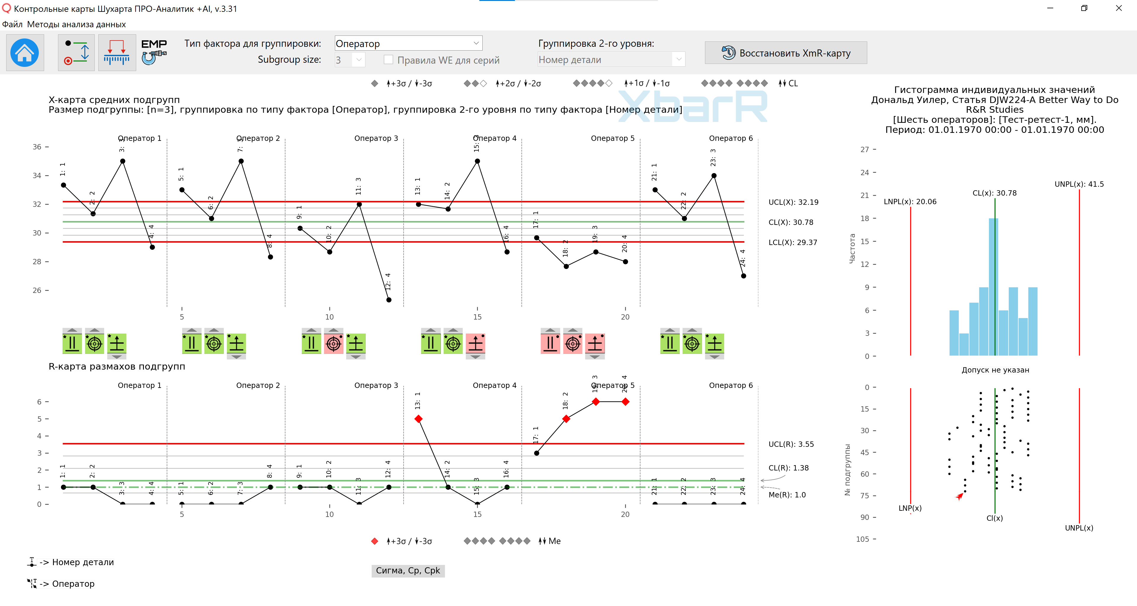
Figure 1: EMP (parallelism, position, consistency) study for a manual testbed. Drawing prepared using our software Shewhart control charts PRO-Analyst +AI .
The key to understanding any XbarR control chart of subgroup means and ranges is to understand what sources of variation are within subgroups and what sources of variation are between subgroups. Figure 1 shows three different sources of variation: differences between operators and parts, which appear between subgroups in the mean map, and differences between repeated measures, which appear within subgroups in the range map.
Test-retest variation found within subgroups is commonly referred to as repeatability. This isolation of test-retest error within subgroups in the range chart and all other sources of variation appearing between subgroups in the subgroup mean chart is a hallmark of the EMP study. Because of this isolation of retest error, the control limits shown in the XbarR control chart of subgroup means and ranges in Figure 1 depend solely on retest error. Thus, the control limits in Figure 1 specifically indicate the amount of change that can only be attributed to measurement error.
As always, the Xbar chart of subgroup means looks for differences between subgroups, while the R chart of subgroup ranges tests for consistency within subgroups. This characteristic of the charts means that the range chart in Figure 1 examines these 24 subgroups to see if there is any inconsistency in the size of retest errors shown. Range values greater than the upper span control limit indicate retest error inconsistency. Since such inconsistencies represent serious problems with the measurement procedure itself, the reasons for these issues are worth studying.
Because the bounds for the control chart of means and subgroup ranges are robust, we can, despite the inconsistency in the R-map of ranges, also use the X-map of means to estimate differences between parts and operators. We begin by discussing variation from part to part.
Differences between parts will depend on how the parts were selected. Sometimes parts may be selected at specific time intervals from the product flow. In another case, parts may simply be randomly selected from a product stream or deliberately selected to represent possible part differences during a particular time period. Regardless of how parts are selected, you will want to detect differences between parts despite the uncertainty caused by measurement error. This means that you will want to find points outside the area formed by the control limits on the X-map of the mean subgroups. Until you have selected the parts so that they are all the same, you are hoping to find points outside the control limits. The Xbar average chart allows for a visual comparison of part-to-part variation and measurement uncertainty. The part-to-part variation is represented by the width of the band, determined by the average values with minimum and maximum values. The measurement error is represented by the width of the band between the control limits of the mean subgroup map. Thus, the wider the band covered by the mean values relative to the width of the band between the control limits, the easier it will be to detect product variations despite measurement error.
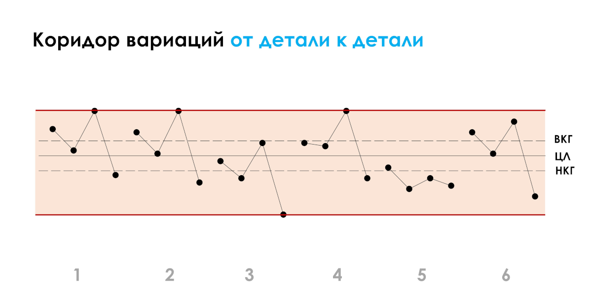
Figure 2.1. Corridor of variations from part to part.
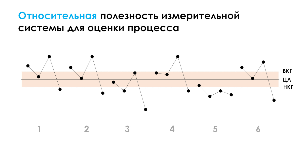
Figure 2.2. Relative utility of the measurement system as demonstrated by the control X-map of subgroup means.
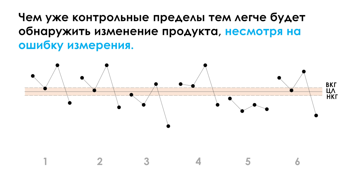
Figure 2.3. The narrower the control limits, the easier it will be to detect changes in the product despite measurement error.
At the same time, when we want to detect differences between parts, we prefer that there are no differences between operators. There are two ways to test differences between operators using a mean map. The first of them uses the forms (parallelism) of the course of values, and the second uses the positions (position) of the course of values. To facilitate both of these comparisons, the EMP study will hide line segments that would connect the points from one operator to the other.
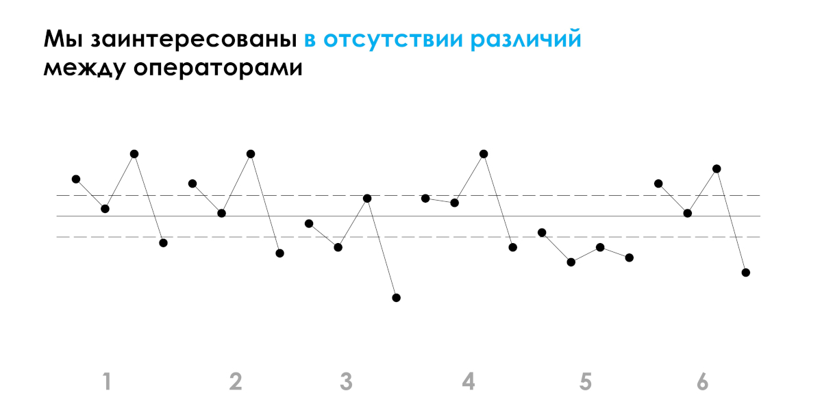
Figure 2.3. There are two ways to test differences between operators using a mean map.
To see how to interpret the shape of the values, it is useful to start by considering what a plot of subgroup means would look like if there were no differences between operators and no measurement error. Under these conditions, the forms of value progression for each operator would be exactly the same. Segment by segment they would be perfectly parallel to each other (like the curves for operators 1 and 2) in Figure 3. However, once we introduce measurement error into our picture of what is happening, we begin to see small deviations from perfect parallelism (more like the curves for operators 4 and 6). As long as there is a reasonable degree of parallelism, we don't need to worry. Here, operators 1, 2, 3, 4 and 6 show a reasonable degree of parallelism. Statement 5, on the other hand, shows a serious lack of parallelism.
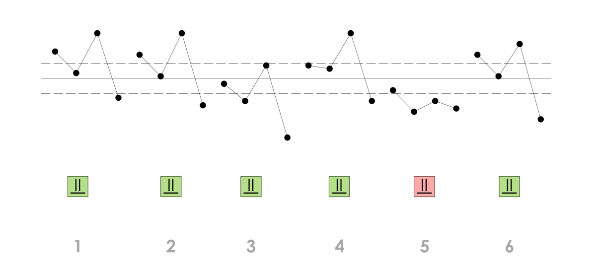
Figure 3. No parallelism for statement 5.
So what does no parallelism mean? Severe non-parallelism indicates an interaction effect between operators and parts. (Algebraically, interaction effects and non-parallelism are the same thing: an interaction effect is impossible without non-parallelism, and vice versa.) Here we see that operator 5 measures these four details in a significantly different way. Since there should be no interaction effects between operators and parts, this interaction represents a serious inconsistency in the measurement process that requires immediate attention. Such interaction effects may be caused by operators using different methods, or by some operators skipping a step in the measurement procedure, or simply by the presence of one or more untrained operators. But whatever the reason, it is a problem with the measurement process that must be corrected.
In addition to checking for concurrency, we can also compare the positions (position) of the progress of records. When we do this, we are essentially comparing the averages of the operators. In Figure 4, we see that both operator 3 and operator 5 have average values that are significantly lower than those of the other four operators. Such differences between operator means are potential operator biases.
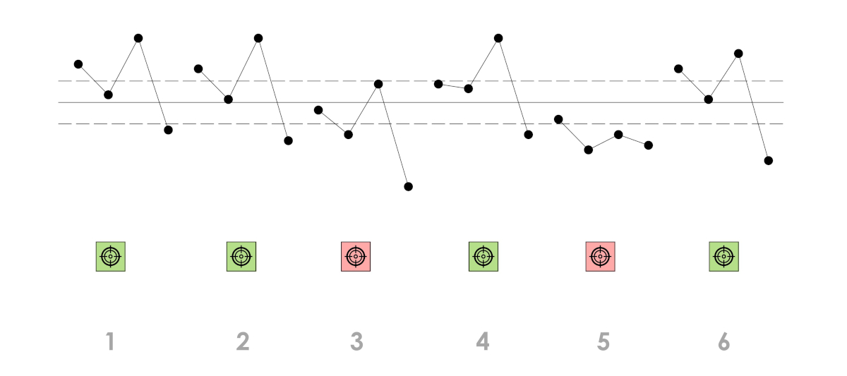
Figure 4. Potential biases of operators 3 and 5.
What does the control XbarR-chart of the averages and ranges of subgroups, built according to the data of a study of the measurement process, say? See the picture below.
Figure 5. EMP (Parallelism, Position, Consistency) study for a manual testbed. Drawing prepared using our software Shewhart control charts PRO-Analyst +AI .
So what can we say about the overall message of the EMP diagram in Figure 5? Operators 1, 2, and 6 show good parallelism, have similar averages (position) for these four details in the Xbar chart of subgroup averages, and demonstrate consistency (repeatability) of retest error in the R-map of subgroup ranges. By comparing the constraint widths with these three value streams (data from statements 1, 2, and 6), we see that the manual testbed can detect a product change.
Operator 3 shows good parallelism on the Xbar chart and a small retest error size on the R range map, but it is consistently low across all of its dimensions on the Xbar map. This is a potential operator bias. The cause of this shift must be determined so that it can be eliminated.
Operator 4 has reasonable parallelism and a good average on the Xbar map, but it has a point above the upper limit of the range R map. Clearly one of his dimensions of part 1 (three dimensions in a subgroup) has problems. Although other subgroup spans on the R-map and reasonable parallelism on the Xbar-map show that it generally does a good job, the reason for this aberrant measurement must be determined.
Operator 5 has large subgroup spans in the R-map, poor parallelism, and an incorrect average for the four parts in the Xbar-map. Say what you will about him, he clearly doesn't know how to use a manual test bench. While Operators 3 and 4 may need to be retrained when using the measuring stand, Operator 5 should be reassigned until he can learn how to use the device and can demonstrate a level of proficiency comparable with the one displayed by other operators.
Of course, the first step is to get operators to measure things the same way and convince them that they are not currently doing so. It is likely that Operators 3, 4 and 5 think that they are measuring these parts in the same way as Operators 1, 2 and 6. Showing them Figure 5 is the first step in convincing them that this is not the case.
So what have we learned?
The EMP study begins by placing the R&R study data on an XbarR reference chart of subgroup means and ranges. Thanks to this, we can make several qualitative estimates before we even start doing any concrete calculations:
- The R-map of subgroup ranges will allow us to determine whether test-retest error is consistent throughout the study and also to judge whether it is consistent from operator to operator. When the test-retest error is not consistent, we will need to figure out why.
- An Xbar chart of subgroup averages will allow us to evaluate the relative usefulness of a measurement system (suitability) by showing whether the measurement process can detect product variation.
- The Xbar chart of average subgroups will allow us to determine non-parallelism between operators. Since any noticeable non-parallelism will indicate an interaction effect between operators and parts, it will alert to serious inconsistencies in the measurement process.
- An Xbar chart of average subgroups will allow you to estimate the likelihood of detectable operator biases. If such symptoms exist, they must be addressed to get the most out of the measurement process.
By the time you build an EMP control chart, you will know what is happening with your data. You will be able to ask interesting questions and you will know if problems exist. One of the basic principles of data analysis is to always start with a graph of the data. Calculations exist to complement graphs, but they can never replace them. When you depend only on calculated values, you are likely to miss many interesting aspects of your data.
The purpose of analysis is understanding, and the best analysis is the simplest analysis that provides the necessary understanding. Moreover, it is useless to discover something when you cannot communicate your discovery to others. EMP research uses the power of the graphical method to assist with both discovery and communication.
In our training seminars we explain in simple terms the essence of methods for evaluating measurement systems using our software .
In our software “Shewhart control charts PRO-Analyst +AI (for Windows, Mac, Linux)” You can take advantage of the following measurement system evaluation functions:
-
Error estimation of a stable measuring system.
-
Checking the displacement of the measuring system detected by the Shewhart control card.
-
Determination of the effective increment (increment) of the measuring system.
-
Evaluating the Measurement Process (EMP).