Control charts for alternative data (attributes, counts) p-chart, np-chart, C-chart and u-chart or one XmR-chart of individual values?
“The difficulty with using p-charts, np-charts, C-charts or u-charts is that it is difficult to determine whether binomial or Poisson models are appropriate for the data.”
We present a translation of Donald Wheeler's article: "What about the p-chart? When should you use the p-chart, np-chart, C-chart, and u-chart control charts for alternative data (counts)?" / Donald J. Wheeler, Article: "What About p-Charts? When should we use the specialty charts p-chart, the np-chart, the c-chart, and the u-chart for count data?" [31]
Translation and notes: Scientific Director of the AQT Center Sergey P. Grigoryev .
Free access to articles does not in any way diminish the value of the materials contained in them.
Content
All count data-based control charts are discrete value charts. Whether we are working with quantities or fractions, we receive one value per time period and want to plot a point on the graph each time we receive a value. This is why four specific control charts were developed for count-based data, even before the approach to constructing XmR control charts of individual values and moving ranges was discovered. These four kinds of control cards are p-card, np-card, C-card, and u-card. This article asks when to use these and other special control charts with count-based data.
The first of these special control charts, the p-chart, was created by Walter Shewhart in 1924. At that time, the idea of using a two-point sliding range to measure the dispersion of a set of individual values had not yet arisen (W. J. Jennett proposed this idea in 1942). So the problem Shewhart faced was how to create a process behavior diagram for discrete values based on counts. Although he could plot the data as a current record, and although he could use the mean as the centerline for that current record, the obstacle was how to measure the variance to filter out normal variations. With discrete values, he saw no way to exploit within-subgroup variation, but he knew better than to try to use a global standard deviation statistic, which would be inflated by any exceptional variance in the data available. Therefore, he decided to use theoretical control limits based on a probabilistic model.
Classic probability models for simple count data are binomial and Poisson, and Shewhart knew that both of these models had a variance parameter that was a function of their location parameter. This meant that the estimate of the mean obtained from the data could also be used to estimate the variance. Thus, with location statistics alone, he could estimate both the centerline and the three-sigma distance.
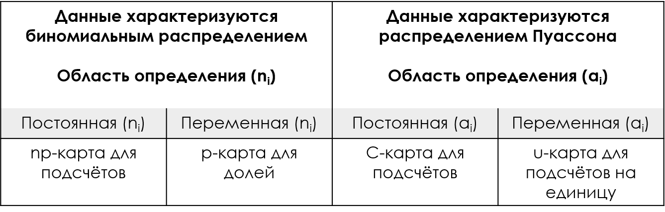
Figure 1: Shewhart's special control charts for these calculations.
This dual use of the mean to characterize both location and variance means that the p-chart, np-chart, C-chart, and u-chart have control limits that are based on the theoretical relationship between the mean and the variance.
Therefore, it can be said that all special control charts use theoretical control limits. If counts can be reasonably modeled using either a binomial distribution or a Poisson distribution, then appropriate control limits can be obtained for the discrete value charts.
In recent years, many textbooks and standards have forgotten that the assumption of a binomial or Poisson model is a primary requirement for the use of these special control charts. This is a problem because there are many types of count-based data that cannot be characterized as either binomial or Poisson distributions. When placing such data on a p-chart, np-chart, C-chart, and u-chart, the resulting theoretical control limits will be incorrect.
So what should we do? The problem with theoretical control limits is the assumption that we know the exact relationship between the centerline and the three-sigma distance. The solution is to obtain a separate estimate of the variance, which is what the XmR-chart does: while the mean will characterize the location and serve as the centerline for the X-map of individual values, the moving average range of the mR chart will characterize the variance and serve as the basis for Calculate three sigma distance for X-map.
Thus, the main difference between the dedicated count control charts and the XmR chart of individual values and moving ranges is the way the three-sigma distance is calculated. The reference p-chart, np-chart, C-chart and u-chart will have the same current entry and essentially the same centerlines as the X-map. But when it comes to calculating three-sigma control limits, dedicated control charts use the estimated theoretical relationship to calculate theoretical values, while the XmR chart actually measures the variation present in the data and constructs empirical control limits.
To compare the custom control cards with the XmR card, we will use three examples. The first one will use the data shown in Figure 2. These values come from the accounting department, which tracks how many accounts are closed “on time” each month. The counts shown represent the monthly number of closures that were completed on time per 35 closures (equal area of definition).
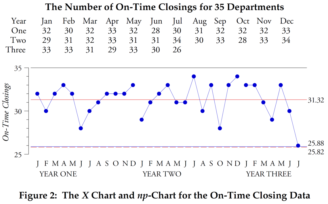
Rice. 2: X-card and np-chart of the monthly number of accounts closed on time out of every 35 accounts.
Red dotted lines are the upper and lower control limits for the X-map, blue for the p-chart.
Here, calculations for both the np-chart and the X-map of individual values yield almost identical control limits (the upper control limit of 36.8 is not shown because it exceeds the maximum value of 35 on-time closures). Here the two approaches are essentially identical because these counts appear to be appropriately modeled by the binomial distribution. If you are skilled enough to recognize when this happens, then you will know when the np card will work and be able to use it successfully. On the other hand, if you are not experienced enough to know when the binomial model is appropriate, you can still use the XmR-chart. As can be seen here, when the np-chart would work, the empirical control limits of the X chart would be identical to the theoretical control limits of the np-chart, and you would lose nothing by using the XmR-chart instead of the np-chart.
In our next example, we will use on-time deliveries for a plant. Data for on-time delivery percentage by month over two years are shown in Figure 3, along with an X-map of individual values and a p-chart for this data.
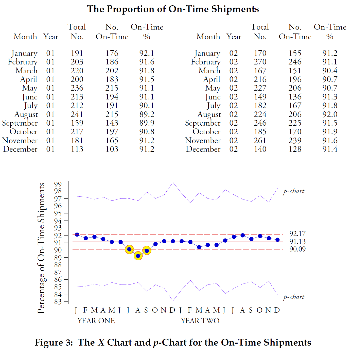
Figure 3: X-map and p-chart for on-time delivery percentage by month over two years.
The X-map shows a process with three points at or below the lower control limit. The variable width p-chart control limits are five times wider than the X-map control limits found using sliding spans. No points extend beyond these p-chart control limits. This discrepancy between the two sets of control limits indicates that the data in Figure 3 do not satisfy binomial conditions. In particular, the probability that a shipment will arrive on time is not the same for all shipments in any given month. Because the binomial model is not suitable for these data, the theoretical p-chart control bounds are incorrect. However, the empirical control limits of the XmR-chart, which do not depend on the fit of a particular probabilistic model, are correct.
Our final comparison will use the data from Figure 4. Here we have the percentage of incoming shipments for one electronics assembly plant that were shipped using air freight. Two points fall outside the control limits of the variable width p-chart, but no point falls outside the control limits of the X-map.
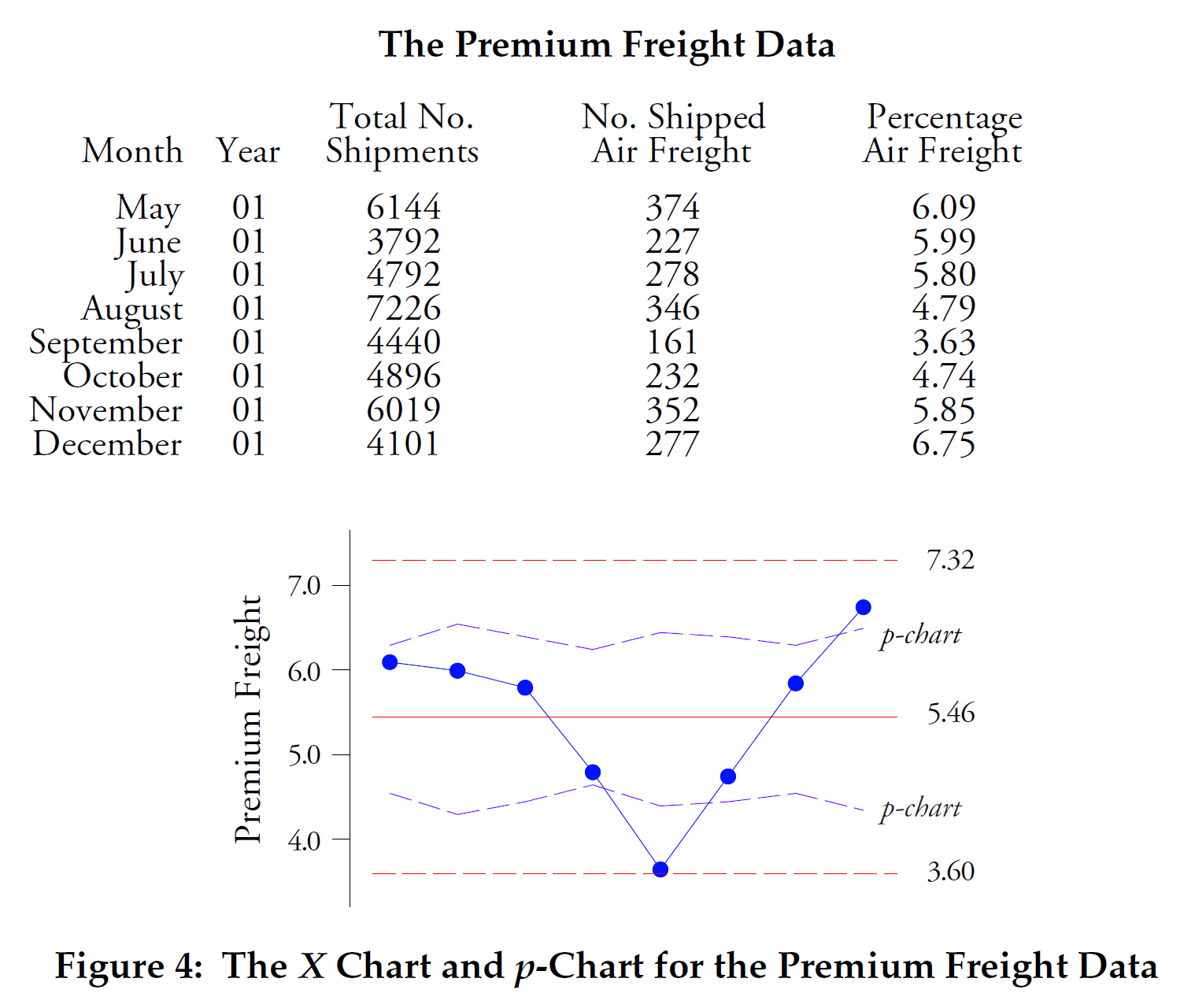
Figure 4: X-map of individual values and p-chart for percentage of shipments using air freight.
Figure 4 is typical of what happens when the "area of opportunity" for counting items becomes excessively large. The binomial model requires that all elements in any given time period have an equal chance of possessing the attribute being counted. This requirement is not met here. With thousands of shipments every month, the likelihood of a shipment being sent by air is not the same for all shipments. Thus, the binomial model is not suitable, and the theoretical p-chart control limits that depend on the binomial model are incorrect. The X-map control limits, which here are twice as wide as the p-chart control limits, correctly characterize both the location and spread of this data and are the correct control limits to use.
Thus, the difficulty with using p-charts, np-charts, C-charts, or u-charts is that it is difficult to determine whether binomial or Poisson models are appropriate for the data. As you can see in Figures 3 and 4, if you miss the primary conditions for special control charts, you risk making a serious error in practice. This is why you should avoid using ad hoc control charts unless you know how to evaluate the fit of the data to these probabilistic models.
Unlike using theoretical models that may or may not be correct, the XmR-chart provides us with empirical control limits that are actually based on the variation present in the data. This means you can use the XmR-chart with count-based data at any time. Since the p-chart, np-chart, C-chart, and u-chart are special cases of discrete value charts, the XmR-chart will mimic these special charts when they are appropriate, and will differ from them when they fail.
In the case of special control cards that have control limits of variable width, the XmR-cut will simulate control limits based on the average definition area of the control cards for counts. Additionally, when making these comparisons, I prefer to have at least 24 counts in the base period.

Figure 5: Assumption-free approach for count-based data.
So, if you don't have advanced degrees in statistics, or if you're simply having trouble determining whether your counts can be characterized by a binomial or Poisson distribution, you can still test your choice of a special chart for your count-based data by comparing theoretical control limits with empirical control limits of the XmR-chart. If the empirical control limits are approximately the same as the theoretical ones, then the probabilistic model works. If the empirical control limits do not match the theoretical control limits, then the probabilistic model is incorrect.
You can always be sure that you have the correct control limits for your count-based data if you use an XmR-chart from the start. The empirical approach will always be correct.
Note (S. Grigoryev)
In his book “Statistical Process Control. Business Optimization Using Shewhart control charts,” Donald Wheeler defines another condition necessary to minimize the impact of the discreteness of calculation data on the empirical control limits of the XmR chart of individual values:
"An XmR-chart for discrete data can be built in all cases where the average count value is greater than one. If it is greater than two, then the effect of discreteness on the control limits will be negligible.
Since it rarely makes sense to use discrete quantities when measurement results can be obtained, the use of attributes is generally limited to situations where mistakes can be counted. However, defining a "blunder" is usually extremely difficult.
The main difficulty in defining a “blunder” is the problem operational definitions ".
Thus, if you have an average of counts per domain of definition less than two, you can easily neutralize this problem by increasing the domain of definition to obtain the average of the counts to a value equal to or greater than 3 (three), which is especially true for events with a Poisson distribution (defects are counted , and not defective products, and only defects can be counted, but in no case the number of “non-defects”).
For example
If you have an average number of defect counts per definition area equal to one square meter of fabric equal to 1 (one), you can use a definition area of three square meters, obtaining an average number of defects per new definition area equal to 3 (three) square meters. Use the definition area that you can easily select for checking (testing), for example, for a roll of fabric 1.2 meters wide, you can use a definition area of 3 linear meters.
Formula for calculating the required minimum domain of definition:
If the average of historical data counts is < 3, then
the new minimum domain of definition is obtained by multiplying the current domain of definition by a coefficient (k):
k = 3/average value of historical data counts;
minimum new domain = k × current domain.
Select the domain of definition (=) or (>) of the resulting minimum new domain of definition that is convenient for control.
For binomial values (yes/no, defective/non-defective, not on time/on time), you can use the XmR-chart for the values of positive rather than negative outcomes, as implemented in examples 1 (Figure 2) and 2 (Figure 3) of this article Donald Wheeler. The effect of binomial model data discreteness on the XmR-chart of individual values follows the same rules as for Poisson models, keep the average of the outcome counts (yes/no) to be at least three (3).
Attention!
If the scopes are different, you cannot compare the counts without converting them to fractions of the corresponding scopes. If it is still difficult for you to interpret the shares, you can bring the obtained calculation values to one area of definition, as in example 1 of this article by D. Wheeler using the example of a control chart of timely closed accounts. To do this, you can use the formula shown below.
What you are looking for:
x i - the number of counts reduced to a constant domain of definition.

“All fractions are fractions, but not all fractions are fractions. A fraction can be considered a fraction when the denominator describes the domain of definition for the numerator values.”
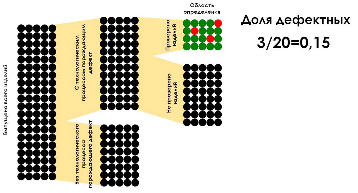
Figure 6: Example of calculating the proportion of defective products per definition area. Only the 3/20 ratio is a fraction.
You should take care to follow all the recommendations in this article at the planning stage data collection. In the vast majority of cases, if the data does not represent the result of 100% control, any manipulation of the available historical data to increase the scope of definition using mathematics will distort the picture of what is happening.