Effective Data Acquisition Frequency for Shewhart control charts
Source: Article by Donald J. Wheeler, "Are You Rational About Sample Frequency and Process Behavior Charts?", Donald J. Wheeler, "Are You Rational About Sample Frequency and Process Behavior Charts?" www.qualitydigest.com
Translation: Scientific Director of the AQT Center Sergey P. Grigoryev .
Free access to articles does not in any way diminish the value of the materials contained in them.
The key to creating effective process behavior charts (Shewhart control charts) is rational sampling and rational aggregation of data into subgroups. As the word “rational” suggests, we must use our knowledge of context to collect and organize data so that it answers the questions that interest us. This article will demonstrate the role that acquisition frequency plays in building an effective XmR-chart.
One of my clients had an online temperature sensor that could take measurements at different frequencies. The process engineer wanted to use this data to create process behavior charts (Shewhart control charts). He started by taking temperature measurements every 128 seconds, resulting in a measurement rate of 28 times per hour. The resulting XmR-chart is shown in Figure 1.
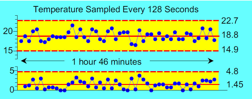
Figure 1. Temperature is measured 28 times per hour.
This control chart (Figure 1) shows 50 consecutive readings covering nearly two hours of production. The process proceeds predictably with an average temperature of about 19°C. Observed temperatures ranged from 16.5° to 21.6°, and the limits of the natural process ranged from 14.9° to 22.7°. So, unless something changes, you can expect these process temperatures to range from 15° to 23° in the future.
The process engineer then measured the temperature every 64 seconds. The resulting XmR control chart is shown in Figure 2.
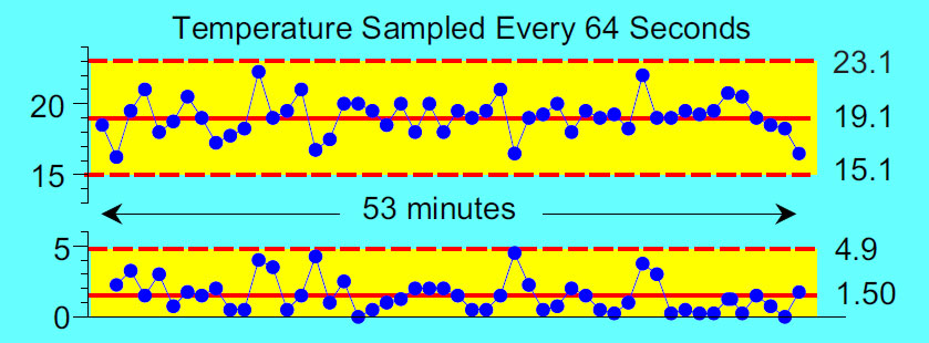
Figure 2. Temperature is measured 56 times per hour.
These 50 consecutive readings (Figure 2) correspond to approximately one hour of production. Again, the chart shows a predictable process with an average of about 19°. Observed temperatures range from 16.2° to 22.3°. The natural limits of the process from 15.1° to 23.1° indicate the same as in Figure 1. Unless something changes, this process can vary from 15° to 23°, with an average of about 19°.
For his next schedule, the process engineer measured the temperature every 32 seconds.
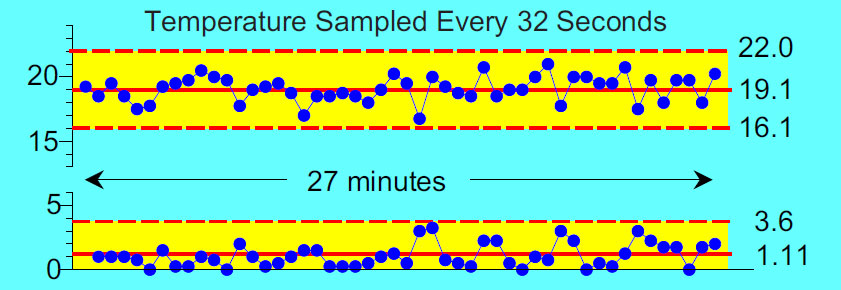
Figure 3. Temperature measurements 112 times per hour.
Fifty consecutive readings (Figure 3) now span a period of approximately 27 minutes. This chart shows a process that works predictably, with an average of about 19°. Observed temperatures range from 16.7° to 20.9°. The natural process limits of 16.1° to 22.0° are slightly narrower than before, but are still consistent with the observed values in all three graphs above.
Changing the sampling rate to one every 16 seconds resulted in the graph in Figure 4.
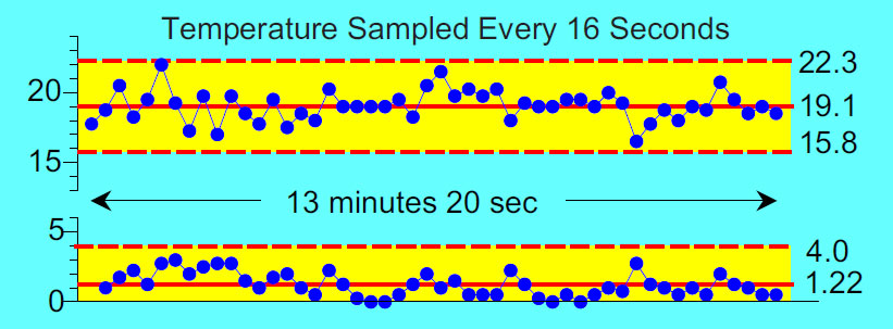
Figure 4. Temperature is measured 225 times per hour.
Now 50 consecutive readings (Figure 4) cover about 13 minutes of process operation. As before, we see a process that works predictably, with an average value of about 19°. Observed temperatures range from 16.6° to 22.2°. The natural limits of the process are from 15.8° to 22.3°.
Up to this point, all four individual value control XmR-charts basically told the same story, even though the calculated values were slightly different. This process proceeded predictably with an average temperature of about 19°C, while temperatures varied from lows of about 15° or 16° to highs of about 22° or 23°. This is the voice of the process. This is what can be expected from this process until it changes in some fundamental way.
Next, the technologist changed the data collection frequency to once every 8 seconds. The resulting diagram is shown in Figure 5.
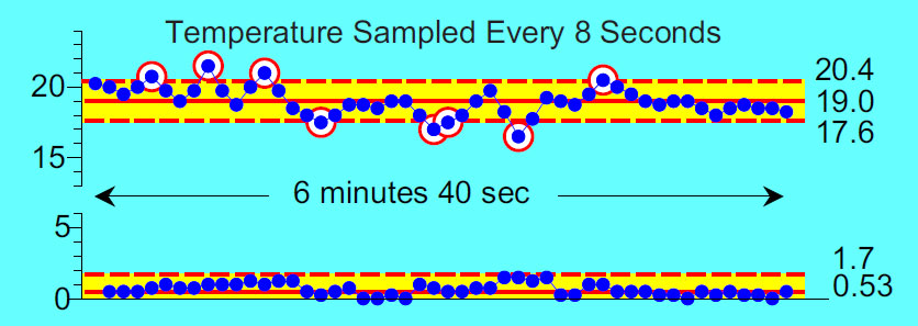
Figure 5. Temperature is measured 450 times per hour.
While the process still averages around 19° and the observed temperatures still vary from 16.6° to 21.0°, we now find eight points outside the calculated limits from 17.6° to 20.4 °. Having 16 percent of the points on the X chart outside is not what we would expect to see from a predictable process.
Next, the sampling rate was set to once every four seconds, resulting in the graph in Figure 6.
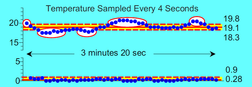
Figure 6. Temperature is measured 900 times per hour.
Our 50 data points (Figure 6) now span less than four minutes. Observed temperatures ranged from 17.5° to 20.8°, with an average of about 19°, but 23 of the 50 values were outside the calculated range of 18.3° to 19.8°.
So what's going on? The shorter we make the process window, the more unpredictable it seems!
Rational sampling
For XmR control charts, rational sampling requirements can be expressed in two statements. First, successive individual values must be logically comparable; and secondly, the differences between successive values must logically reflect changes in the ongoing process - this is why we talk about rational sampling. It is rational sampling that allows the control chart to reveal both the potential of the process and its performance. Without rational sampling, our calculations will not have a foothold, and the data will not serve as a lever for understanding the process.
In the examples above, we compare successive temperatures collected from a single point over time. So, successive values are logically comparable, and the first requirement is satisfied.
Regarding the second requirement, we see that the first two control charts have average moving ranges of 1.45° and 1.50° (mR charts). Both of these charts estimate process voice to be approximately 19° ± 4° (X-maps). In the next two control charts, the average sliding ranges are 1.11° and 1.22°, and the process voice is estimated to be approximately 19° ± 3.4°. Thus, the first four graphs essentially tell the same story, and the intervals of 16 to 128 seconds between observations are sufficient for successive differences to capture the normal variations inherent in the process. The similarity of these four graphs shows the reliability of the method for constructing process behavior charts (Shewhart control charts). We don't have to get everything exactly right all the time to characterize the behavior of a process.
In the last two graphs at eight second and four second intervals, the successive differences do not reflect changes in the ongoing process. There is not enough time between successive readings. As a result, moving ranges are limited, average moving ranges are underestimated, and X-map limits are too narrow to describe natural process variation.
Thus, when sampling online readings for process behavior charts, too high a sampling rate can lead to limitations that do not reflect either process potential or performance. Truncated differences between successive readings will reduce the moving average range and, as a result, artificially narrow the X-map limits. This is one of two known failure modes in which the XmR reference card calculations result in an excessive number of false positives.
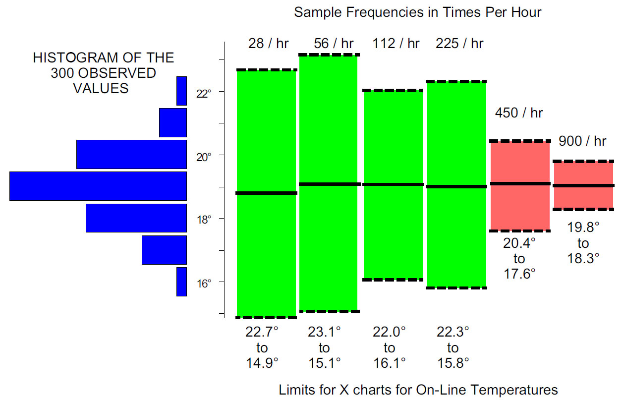
Figure 7. Effect of measurement sampling frequency on the control limits (boundaries) of the Shewhart chart.
The first four sets of constraints (Figure 7) describe the data from all six graphs quite well. The last two sets of restrictions are completely unworkable.
So how can you avoid this problem? You have to think about your process and understand how quickly it changes. When determining the appropriate data collection frequency, you can do what the process engineer did here and try different frequencies to see how the story told by the control charts changes. As shown in the first four graphs, when the sliding ranges capture the change in the process, the limits effectively stabilize and the graphs begin to show the same pattern. But when the frequency of data collection is too high, the limits begin to shrink.
Unpredictable processes
When sampling online readings from an unpredictable process, it is possible to make the process more predictable by sampling too low. Again, judgment with an understanding of the context is required. Typically, there will be some region between frequencies that are too low and frequencies that are too high, where different acquisition frequencies will result in the same limitations. These will be sample frequencies where the control charts will describe both the potential of the process and its performance.
Two types of actions
But what if 15° to 23° is too much variation for the process described above? If 19° ± 4° is unsatisfactory, then this predictable process will need to be fundamentally changed in some way. Distorting things by artificially tightening the boundaries of the process behavior chart (Shewhart control chart) by increasing the sampling rate will not help.
The purpose of a process behavior chart is to characterize the behavior of a process so that appropriate actions can be taken as and when required. And there are two fundamentally different courses of action that can be taken to reduce variation.
For an unpredictable process, the appropriate action is to identify the special causes of exceptional variations so that they can be controlled in the future. As these special causes are identified and controlled, process variation will be significantly reduced.
For a predictable process that still has too much variation, the appropriate action is process reengineering. Searching for non-existent attributed (special) causes would be a waste of time and effort.
To know which type of action is appropriate, you first need to construct a process behavior chart (Shewhart XmR control chart) that reflects both the process potential and its performance. This requires rational sampling.
The last section, "Two Types of Actions," in Donald Wheeler's article on Type I and Type II errors. Look definition of these types of errors, given by Edwards Deming.
"SPC is a way of thinking with some additional tools. Learn a way of statistical thinking and the tools come to life."